Talk To Our Expert, Get A Solution in 20 minutes
Share your LED screen needs. Our experts will provide solutions and a quick response.

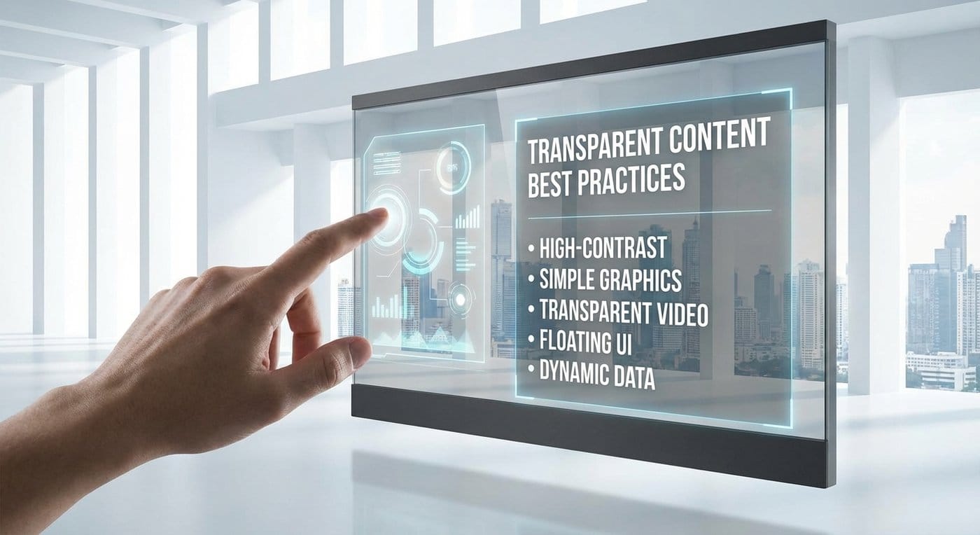
Transparent screens don’t fail because the hardware is “not bright enough.” They fail because teams run normal TV-style content on a surface that is not a normal screen.
Glass adds reflections, daylight, and a non-negotiable expectation: it still has to feel like glass. If you design content like a solid LED wall, you’ll get “washed out,” “messy,” or “why does it look like a grid?” feedback fast—especially in storefront windows.
This guide gives you content rules that actually work, plus reusable templates you can hand to designers and signage operators.
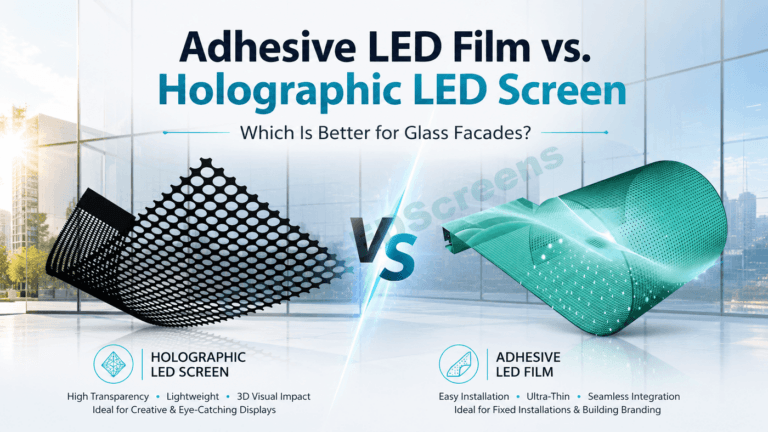
If your team is still aligning on screen types (cabinet vs film vs glass), start with the portfolio overview on ChinaLEDScreens and then pick the right category based on the installation style and viewing distance.
On a standard LED wall, you fight ambient light once. On (or behind) glass, you fight it twice: ambient + reflections—often at changing angles through the day.
Content implication: subtle shadows, dark scenes, and soft gradients might look premium in a studio, but become a faint haze in a bright window.
If you’re using cabinet-style transparent displays, the typical performance expectations and tradeoffs are covered in Transparent LED Screens.
When buyers say “invisible screen,” they’re usually asking for perceived transparency: the interior, products, and depth behind the glass must still feel open.
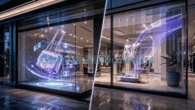
Content implication: the best transparent-screen content uses low coverage + strong focus (a few bright elements floating in space), not full-screen video trying to behave like a TV.
For a deeper hardware+application baseline (pitch, brightness, and how transparency changes real-world readability), reference Transparent LED Display Guide.
Window audiences don’t “watch.” They glance while moving. Your content should be structured to win in layers:
This is why transparent content works best when it’s designed like high-end signage, not cinema.

What it is: one product silhouette or hero visual + one short line (3–6 words). Why it works: it preserves “glass feel,” stays readable under reflections, and fits how people actually consume window content.
Template (6–10s loop):
Design rule: keep total “lit area” low. If the screen is mostly lit pixels, the glass stops feeling like glass.
What it is: large bold type, animated simply (slide, wipe, scale). Why it works: text can be very readable on transparent screens if it’s bold, short, and high-contrast.
Typography rules that hold up on glass
| Rule | Do | Don’t | Why it matters |
|---|---|---|---|
| Stroke weight | Bold/heavy fonts | Thin fonts | Reflections reduce perceived contrast |
| Length | 3–6 words | Full sentences | People won’t stop long enough |
| Contrast | Bright text + outline | Gray-on-gray | Glass lifts black level |
| Motion | Simple entrance/exit | Noisy motion | Makes structure/grid more obvious |
Practical examples:
Transparent displays often create a “floating” or slightly “ghost-like” visual. Instead of fighting that, use it.
What works well:
Why it works: edges survive reflections better than mid-tone fills, and they keep the background visually open.
If your creative direction is intentionally “floating / holographic,” pull inspiration from the content style considerations in Holographic LED Screens Guide (even if you’re deploying transparent LED—this creative language transfers well).
Many installs look amazing on day 1… then become annoying on day 7 because the content is too intense to live with.
Ambient loops keep the space “alive” without shouting:
When to use:
CTAs can convert—but CTA overload kills both readability and premium feel.
Best CTA formats:
Placement tip: put CTAs near a logical action point (door zone / eye level). Otherwise people notice but don’t act.

Cinematic footage that relies on shadow detail becomes weak in daylight. If the creative needs subtle lighting to feel premium, it’s risky for glass installs.
On large glass surfaces, low-contrast gradients can read as “dirty glass” or visible banding—especially when reflections change through the day.
Transparent screens are not brochures. If the business needs detailed reading, keep the detailed content inside (controlled lighting) and use the window for the hook.
Physical structure already creates a pattern. Busy textures fight that structure and make the grid feel more obvious.
Daytime content should prioritize:
Day recipe:
At night, the screen can dominate the façade and interior visibility becomes more sensitive.
Night content should:
Best when you need scalable size, serviceability, and a stronger “screen” presence. Content can be bolder, but low coverage + high contrast still wins.
Film can look extremely “glass-first.” To keep that premium feel, content must stay disciplined: minimal coverage, simple motion, high contrast. If you’re building a film-based install, align content expectations with the constraints discussed in LED Film Screens Guide.
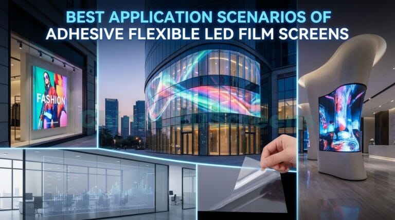
When the top KPI is “still looks like glass,” treat content like architecture: clean, minimal, calm. For glass-integrated solutions and positioning, reference LED Glass Screens and design your creatives to respect the space behind the glass.
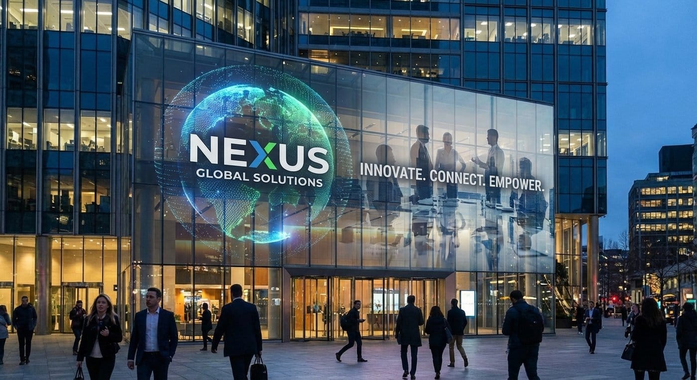
Inputs you must define:
Creative rules you must define:
Validation you must require:
To align expectations early, compare against real deployments and how content behaves in real environments using Projects & Case Studies.
Transparent screens win when content behaves like a floating layer: bold, simple, high-contrast, and respectful of the glass behind it. Design for the first 3 seconds, keep coverage low, and build separate day/night playlists—and you’ll get a result that looks premium and performs in the real world.