-
Address: Howay Tech Building, No.2 South 8th Keji Road, Hi-tech Park, Nanshan, Shenzhen
-
Email: chris@chinaledscreens.com
-
Website: https://chinaledscreens.com
Contrast & Black Level on Transparent LED

Contrast & Black Level on Transparent LED
what specs don’t tell you—and how to make windows look premium
When buyers complain that a transparent LED “has poor contrast,” they rarely mean the lab contrast ratio printed on a datasheet. What they mean is simpler—and harsher:
- Black doesn’t look black. It looks gray, milky, or “washed out.”
- Text loses punch in daytime storefronts.
- Content feels cheap because shadows collapse and the image lacks depth.
If you’re an AV integrator, engineer, architect, or brand owner, this is the difference between a window display that stops traffic and one that looks like a faint overlay.
This guide explains the physics behind contrast on transparent LED, the measurement traps that create “spec sheet wins / real-world losses,” and the engineering + content levers that actually improve black appearance on glass. For broader product context and application planning, start at ChinaLEDScreens.
Table of Contents
Why transparent LED contrast is fundamentally different
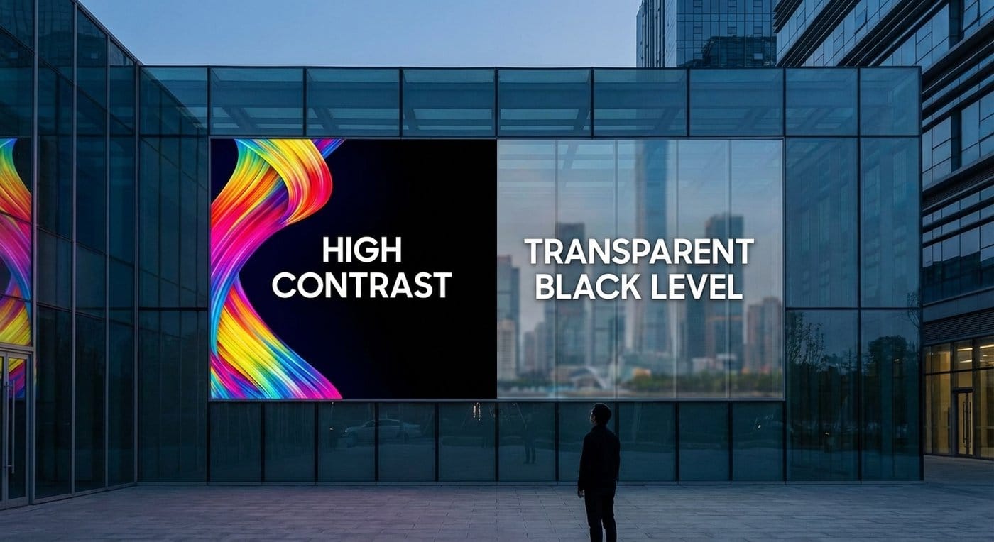
“Black” is not a pixel state—it’s your background (plus glare)
On a conventional LED wall, “black” is (ideally) the panel’s minimum luminance when pixels are off—limited by stray light, internal reflections, and electronics. Standards even define black level in a way that can include unwanted leak light and veiling glare from ambient illumination.
On a transparent LED, you add one more factor that dominates everything:
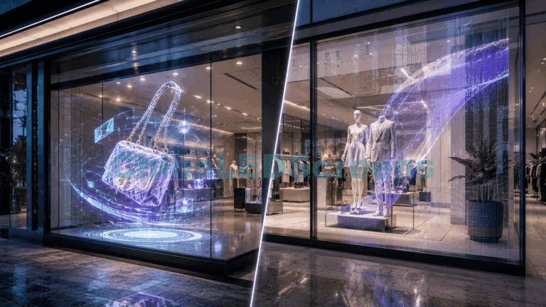
The real-world scene behind the display is literally part of the image. That means your “black” is often:
- the store interior brightness seen through the glass,
- the sky / street / mall corridor behind it, and
- reflections on the front glass surface.
So the question is not “How black can the LED turn off?” It’s “How much brighter can the LED make the on parts than whatever the viewer sees behind the off parts?”
This is why a transparent LED that looks great in a dark demo room can look underwhelming on a sunlit façade.
Contrast ratio has multiple meanings—pick the right one
“Contrast ratio” is broadly the ratio of bright-state luminance to dark-state luminance. But the test pattern matters:
- On/Off contrast: full white screen vs full black screen.
- Good for emissive panels in controlled rooms; misleading for windows.
- ANSI (checkerboard) contrast: bright and dark patches at the same time.
- Closer to real content; penalizes internal scatter/flare.
- Ambient Contrast Ratio (ACR) (practical signage view): accounts for ambient reflections and background luminance.
- Most predictive for transparent LED.
HDR programs like VESA’s DisplayHDR put emphasis on on-scene contrast using specific patterns because “single-number contrast” is not enough.
Takeaway: When you discuss contrast for transparent LED, always define:
- pattern (checkerboard, window, full-field),
- ambient (lux),
- viewing geometry (angle/distance),
- background condition (what’s behind the glass).
Table A — Key definitions (use standards language where possible)
| Term | Practical meaning for transparent LED | Why it matters |
|---|---|---|
| Luminance (cd/m², “nits”) | Brightness emitted or reflected toward the viewer | Contrast is computed from luminance levels |
| Black level | Minimum luminance of the display’s dark state; standards definitions can include ambient veiling glare effects | This is why “perfect black” is unrealistic on glass |
| Contrast ratio | Ratio of bright-state luminance to dark-state luminance | Needs a stated pattern + ambient condition |
| Veiling glare | Stray light/reflections that lift blacks | The hidden killer of “spec sheet” contrast |
| On-scene / local contrast | Contrast achievable within a scene/test pattern | More predictive than a single on/off number |
The daylight problem in one table (why black lifts so easily)
A useful approximation for many real surfaces is the Lambertian relationship:
L ≈ E · ρ / π Where E is illuminance (lux), ρ is reflectance, and L is luminance (cd/m² ≈ nits).
Now connect that to daylight. Outdoor illuminance can reach roughly 120,000 lux in direct sun.
Even if what’s behind your glass is “dark-ish,” the reflected/seen luminance can be huge. In moderate daylight (10,000 lux), a background with reflectance 0.10 can sit around ~318 nits. That’s not a deep black. That’s “bright gray.”
Table B — Why daylight nukes “black”: lux → reflected nits (Lambertian approximation)
Relationship (diffuse surface): L ≈ E · ρ / π
- E = illuminance (lux)
- ρ = reflectance (0–1)
- L = luminance (cd/m² ≈ nits)
| Ambient illuminance (lux) | ρ=0.05 (very dark) | ρ=0.10 (dark) | ρ=0.20 (mid) | ρ=0.60 (bright) |
|---|---|---|---|---|
| 300 | 4.8 | 9.5 | 19.1 | 57.3 |
| 500 | 8.0 | 15.9 | 31.8 | 95.5 |
| 2,000 | 31.8 | 63.7 | 127.3 | 382.0 |
| 10,000 | 159.2 | 318.3 | 636.6 | 1,909.9 |
| 50,000 | 795.8 | 1,591.5 | 3,183.1 | 9,549.3 |
| 120,000 (direct sun) | 1,909.9 | 3,819.7 | 7,639.4 | 22,918.3 |
What this means for transparent LED black level
If the background is ~300 nits and your LED is trying to show near-black detail at 5–20 nits… the eye won’t see it as “black detail.” It will be swallowed by the bright baseline.
So contrast improvements come from two directions:
- Raise the “white” (effective on-luminance where it matters), and/or
- Lower the “black baseline” (background + reflections + veiling glare).
You rarely get to do only one.
Table C — Ambient reference points (useful for spec’ing demos)
| Scenario | Typical illuminance clue | Source |
|---|---|---|
| Office / clerical tasks | ~500 lux (example tables) | IES-style lux tables |
| Office field measurements | >500 lx observed on desks in some cases | U.S. DOE report |
| Outdoor daylight range | Up to ~120,000 lux in direct sun | Daylight reference |
Engineering levers that improve perceived contrast (in the real world)
1) Brightness headroom (but specify it the right way)
More brightness is the simplest lever—until it isn’t.
Problems you’ll hit:
- Power limiting / ABL: some systems can’t sustain peak brightness at high APL without throttling.
- Thermal derating: heat reduces sustained output and accelerates aging.
- Content-dependent brightness: a “10% window” might be bright, but full-screen content is lower.
HDR evaluation guidelines and programs often differentiate peak output by window sizes/patterns for this reason.
What to specify in an RFP (transparent LED-friendly):
- Peak luminance (nits) at 10% window and at a high APL pattern.
- Sustained luminance after 30–60 minutes at a defined ambient temperature.
- Brightness uniformity tolerance (because bright hotspots kill perceived quality faster than a slightly higher contrast number). ISO display ergonomics standards explicitly treat luminance/contrast as key to comfortable viewing.
2) Reduce veiling glare and reflections (the hidden contrast killer)
Transparent LED sits on glass, which is a reflection machine. Even if the LEDs can go “dark,” the viewer sees:
- specular reflections of the sun/sky/lighting,
- scattering from dust and micro-scratches,
- internal reflections within laminated layers.
Standards terminology explicitly calls out veiling glare from ambient illumination as part of what can lift black. (Iteh)
Practical tactics:
- AR coatings / films on the outermost surface to reduce specular reflection.
- Anti-glare diffusion (careful: diffusion can reduce perceived sharpness and may lower transparency clarity).
- Architectural shading: overhangs, fins, or strategic placement can do more than 10% extra brightness.
- Control interior lighting at night: bright interior lights behind the display destroy black depth.
3) Increase effective “black mask” and fill factor
For transparent LED, the structure that holds LEDs—black PCB, mask, micro-frames—can be your friend. You’re trading transparency for contrast.
Mechanism: A darker structural background reduces stray reflections and makes “off” areas look less like floating haze.
Design approaches:
- Blacker PCB/mask materials with low reflectance.
- Geometry that hides specular paths (tiny louvers or baffles around emitters).
- Higher fill factor (within transparency limits) so the on-pixels dominate the visual impression.
4) Choose the right transparent architecture (don’t force one tech to do all jobs)
Transparent LED is not one category; it’s several families, each with different contrast behavior:
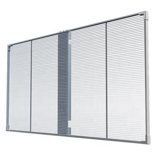
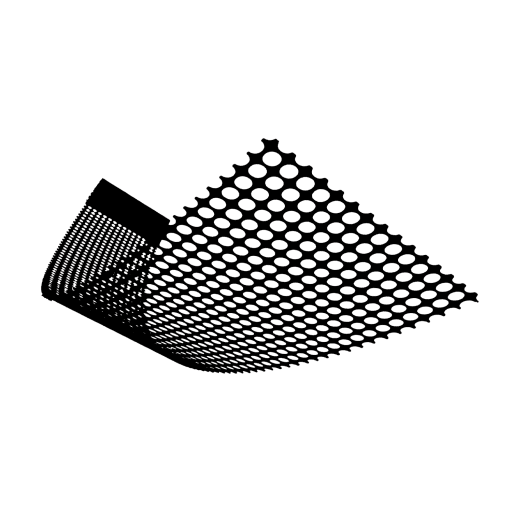
- Grille/mesh styles: excellent airflow and facade scale; contrast depends heavily on background and viewing distance.
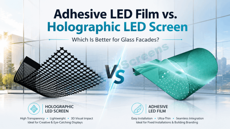
- Film-based transparent displays: often better for close viewing and uniformity on glass, with different reflection behavior. If you’re evaluating film options and how they behave on windows, your planning can reference the self adhesive LED film selection guide.
- LED glass (integrated): can improve “optical cleanliness” in some designs, but cost and installation complexity rise.
From an engineering workflow standpoint, it’s smart to start with your application requirements (day/night, distance, transparency target) and map to the appropriate solution category. For project-style examples, use projects & case studies; for scenario planning by industry, use transparent LED display solutions.
5) Maintenance is an optical spec (dust lifts black)
This is the unglamorous truth: dust and grime scatter light. Scattered light becomes haze. Haze becomes lifted blacks.
If you’ve ever watched a “black” area turn milky on a dirty storefront window, you’ve seen veiling glare in action—just caused by contamination rather than glass physics.
Put this in the handover plan:
- cleaning frequency, acceptable cleaning agents, microfiber rules, and inspection criteria (especially for high-end retail).
Content strategy: how to make blacks look deeper on transparent LED
Engineering can only do so much when the baseline background is bright. That’s where content design becomes part of the contrast system.
1) Stop designing “cinema blacks” for daylight windows
Near-black shadow detail is beautiful in a dark theater. On a window at noon, it becomes invisible mush. If your content spends time between 0–10% signal level, it will look flat.
Do instead:
- Lift the toe (near-black) so details sit above the background baseline.
- Use strong local contrast edges (bright text with controlled outlines).
- Favor mid-tones and saturated colors that survive washout.
Perception research shows that differences in very low black luminance can be distinguishable under controlled conditions, but real environments add glare and adaptation effects that overwhelm subtle near-black distinctions.
2) Design with the real background in mind
The background is not neutral. It changes:
- Day vs night
- Cloudy vs sunny
- Interior lighting on/off
- Seasonal sun angle
- Foot traffic and moving objects behind glass
Practical workflow:
- Capture short video clips of the background from the main viewing positions at key times (morning/noon/evening).
- Grade content against those clips (yes, like VFX compositing).
- Build day playlists and night playlists.
3) Control APL and avoid “washy” compositions
High APL content (large bright areas) can reduce perceived depth because everything is bright and the eye adapts. Low APL with bright accents can look “higher contrast,” but only if the accents beat the background luminance.
A good rule for transparent LED windows:
- Use bold shapes, clear typography, and intentional negative space—but don’t assume negative space will be black.
4) Add contrast where the eye reads it: edges and text
For wayfinding, promotions, and brand statements:
- Use thicker strokes, high-contrast color pairs, and subtle edge separation.
- Prefer off-white text rather than pure white if blooming/glare is an issue.
How to test suppliers without getting fooled (demo + acceptance checklist)
If you want contrast/black-level performance you can trust, you need a demo protocol that matches the site.
Step 1: Record conditions (make your test repeatable)
- Ambient illuminance (lux) at glass plane (day and night).
- Orientation and sun exposure.
- Interior lighting state behind the glass.
- Viewing distance and angles.
SMPTE work on screen luminance measurement highlights that methodologies vary and measurement approach matters.
Step 2: Demand pattern-based measurements (not just a single number)
Ask for luminance measurements for:
- Full white, full black
- Checkerboard (ANSI-style)
- Small bright window on dark background (10% and 3% windows)
This aligns with the broader industry trend toward pattern-specific, on-scene measures.
Step 3: Evaluate “black” as an appearance metric, not a spec
In transparent LED, black is appearance:
- Stand at the primary viewing position.
- Show 0% signal (black) and note what dominates: interior scene, reflections, haze, structure visibility.
- Then show real content (not vendor demo loops only). Use your brand assets.
Step 4: Acceptance criteria you can actually enforce
Instead of “contrast ratio must be X:1” (often unenforceable), use:
- Minimum readable text size at distance in daytime.
- Minimum measured luminance for key colors at defined lux.
- Uniformity thresholds (no hotspots).
- Photo/video documentation standards (camera settings locked).
Application-based guidance (what “good” looks like in practice)
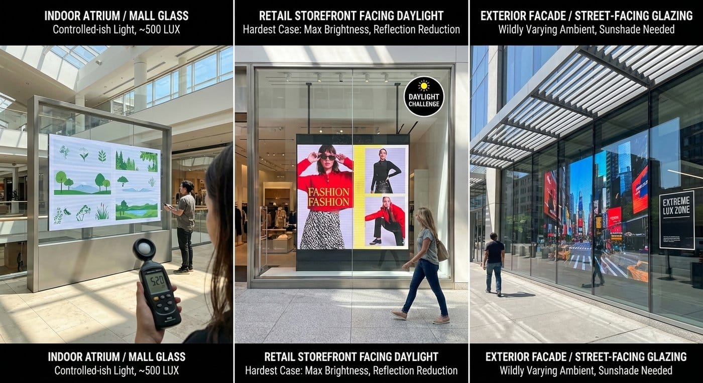
Indoor atrium / mall glass (controlled-ish light)
- You can win with moderate brightness if reflections are managed.
- Prioritize uniformity, clean optics, and content design.
Reference lux: office-like values around 500 lux are common as a mental anchor.
Retail storefront facing daylight
- This is the hardest case.
- Plan for: maximum sustainable brightness, reflection reduction, and day-grade content.
Exterior facade / street-facing glazing
- The background and ambient vary wildly; direct sun pushes lux extremely high.
- You may need architectural shading, different transparency targets, or a different display family in the brightest zones.

What to do next (practical decision path)
- Classify your site (indoor atrium vs storefront vs exterior, plus sun exposure).
- Define your real KPI (readability, brand “premium black,” or visibility from distance).
- Choose the architecture that fits the KPI (not the other way around).
- Write an RFP that specifies patterns, ambient conditions, and sustained performance—not marketing contrast.
- Plan content as part of the optical system (day/night playlists).
- Document maintenance as an optical requirement.
If you want, you can route this into an engineering + demo plan and quote package via Technology & Quality, and when you’re ready to compare options for your specific glass condition, reach out through Contact ChinaLEDScreens.