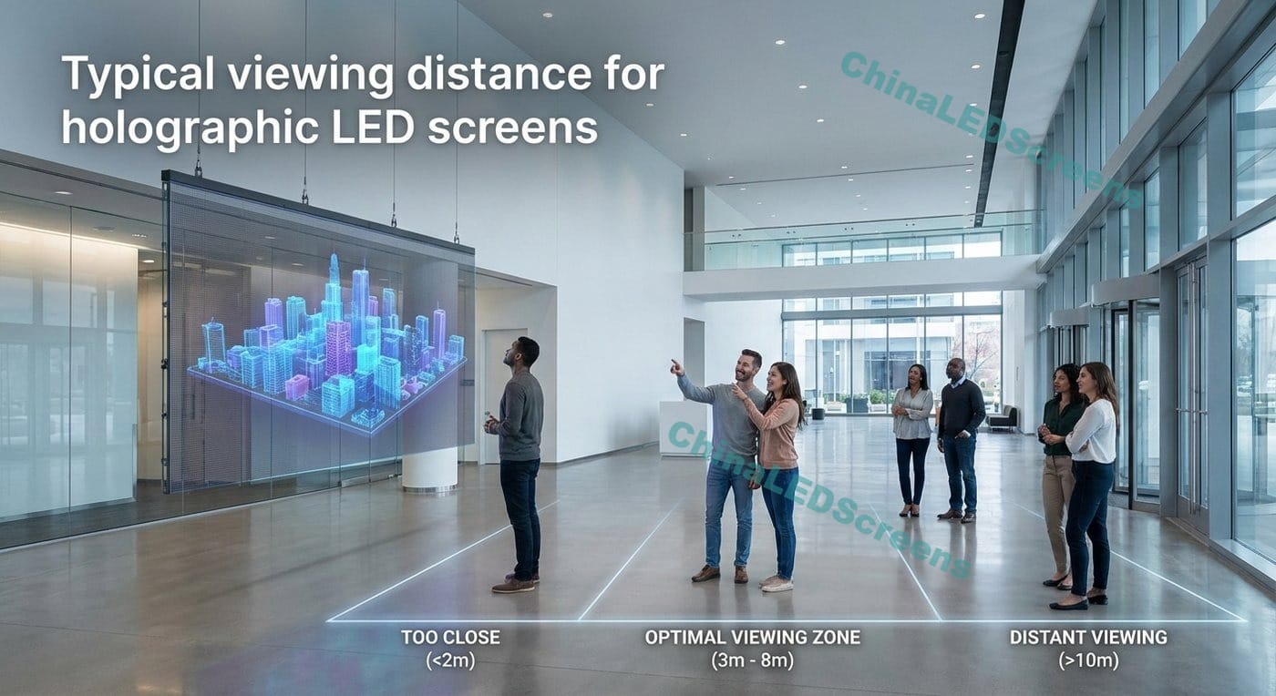
Typical viewing distance for holographic LED screens
Typical viewing distance for holographic LED screens
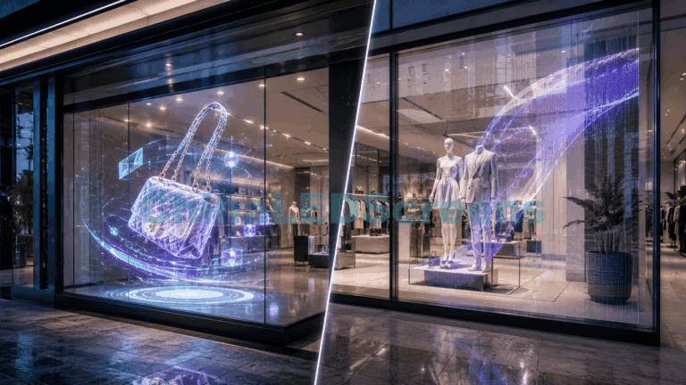
If you’ve ever watched a holographic LED screen in a retail window and felt the visuals “float,” you already know the experience is not the same as a standard LED wall. The tricky part is that viewing distance decisions still start with pixel pitch—but transparency, reflections, and content style can shift what “typical” really means.
This guide gives you the practical answer buyers want: a pitch-to-distance table, plus the real-world rules that professionals use to avoid overspending (too fine) or disappointing (too coarse).
To keep everything consistent with our internal knowledge base, the internal references below are all from ChinaLEDScreens.
Table of Contents
Quick answer: typical viewing distance by pixel pitch
The most useful rule-of-thumb
For most LED displays used at human scale, a simple heuristic works:
Far viewing distance (m) ≈ 6–10 × pixel pitch (mm) (still readable, less detail)
So a P3 holographic LED is usually:
“Okay” from ~2.5–4.5 m
“Looks right” from ~6–12 m for video / motion visuals
But holographic LED screens often run high-contrast, floating-style content, which means you can sometimes go slightly coarser than you’d choose for a normal LED wall—as long as you are not trying to show fine text.
Below is a practical distance chart that works well for retail windows, exhibitions, event entrances, and stage effects.
How to read it:
Minimum = pixels may be visible, but content is still watchable.
Recommended = where it looks clean to most viewers.
Far = still effective for motion, logos, and big shapes.
Pixel Pitch
Minimum Distance
Recommended Distance
Far Distance Use
P1.8
1.5–2.5 m
3–7 m
10–18 m
P2.0
1.6–3 m
4–8 m
12–20 m
P2.5
2–4 m
5–10 m
15–25 m
P3.0
2.5–5 m
6–12 m
18–30 m
P3.9
3–6.5 m
8–16 m
25–40 m
P4.0
3–7 m
8–18 m
25–45 m
P6.0
5–10 m
12–25 m
40–60 m
What’s “typical” for holographic LED screens? In real projects, most holographic installs land in P2.5–P4, because:
close viewers are often 2–6 m away (storefront sidewalk, booth aisle, event walkway),
content is motion-heavy, not spreadsheet-text-heavy,
transparency and floating effects prioritize impact over fine-detail.
If you want a deeper product-category framing around holographic displays, you can cross-check with our internal guide: Holographic LED Screens Guide 2025.
Why holographic LED screens “feel different” from normal LED walls
1) Transparency changes perceived resolution
A traditional LED wall is visually “solid.” Your eyes judge it like a TV: pixel pitch → perceived sharpness.
A holographic LED screen is often:
a grid / mesh-like emissive structure, and
visually mixed with the background behind the screen.
This creates two effects:
Your eye focuses on the “bright object edges,” not on a fully filled image plane.
The background provides visual noise and depth, which can mask pixel structure.
Result: For floating, high-contrast content, you can often choose P3–P4 and still get a premium effect—especially in environments where people don’t stand 30 cm from the glass to read fine text.
2) Glass reflections can force you to “upgrade pitch” (or redesign content)
Reflections are the silent killer of clarity. Even with enough brightness, reflections reduce contrast. And contrast is what defines edge detail.
If you cannot control reflections with:
screen angle,
ambient lighting,
background treatment (dark interior behind the window),
or AR film / coated glass,
you may need either:
finer pitch (to keep detail readable), or
simpler content (bigger text, thicker strokes, fewer fine lines).
3) Content style drives viewing distance more than most people expect
This is the professional shortcut:
Text & UI-like content (prices, schedules, QR codes) → requires finer pitch and shorter recommended distance.
Brand visuals, animation, silhouettes, product highlights → allows coarser pitch, and the “typical distance” becomes more forgiving.
If your project includes both, do not average it. Design to the most demanding element (usually text).
The “human eye” way to sanity-check viewing distance
If you like engineering-style verification, here’s the logic:
Human 20/20 visual acuity is roughly the ability to resolve ~1 arcminute detail.
That means at 10 m, the smallest resolvable detail is roughly ~3 mm (very approximate, but useful).
So:
At 10 m, a P3 structure is around the limit where pixel structure becomes less obvious.
At 3 m, P3 can still look visibly “pixelated” if content includes thin lines.
Practical takeaway: If your closest viewers are within 2–3 m, and you must show text, you should strongly consider P2–P2.5. If closest viewers are 5–8 m, P3–P4 is usually safe for holographic-style content.
P2.5 if you need legible text (promotions, pricing)
P3 if content is primarily motion visuals + logos
P3.9–P4 if the screen is large and viewing starts farther back (across a lobby or wide plaza)
If you also use transparent LED solutions in the same storefront family, the pitch/brightness context aligns well with Transparent LED Display Guide 2025.
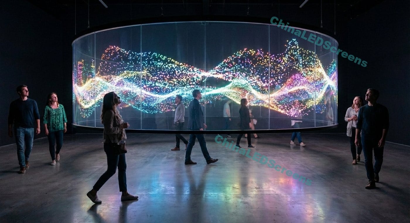
Scenario B: Exhibition booths and brand activations
Here viewing is messy:
people stop unexpectedly at 1–2 m,
then walk away to 5–15 m.
If you care about close-up experience:
P2–P2.5 is the practical sweet spot.
If it’s purely a visual attractor (not a “read this” display):
P3–P4 works well, and you save cost and power.
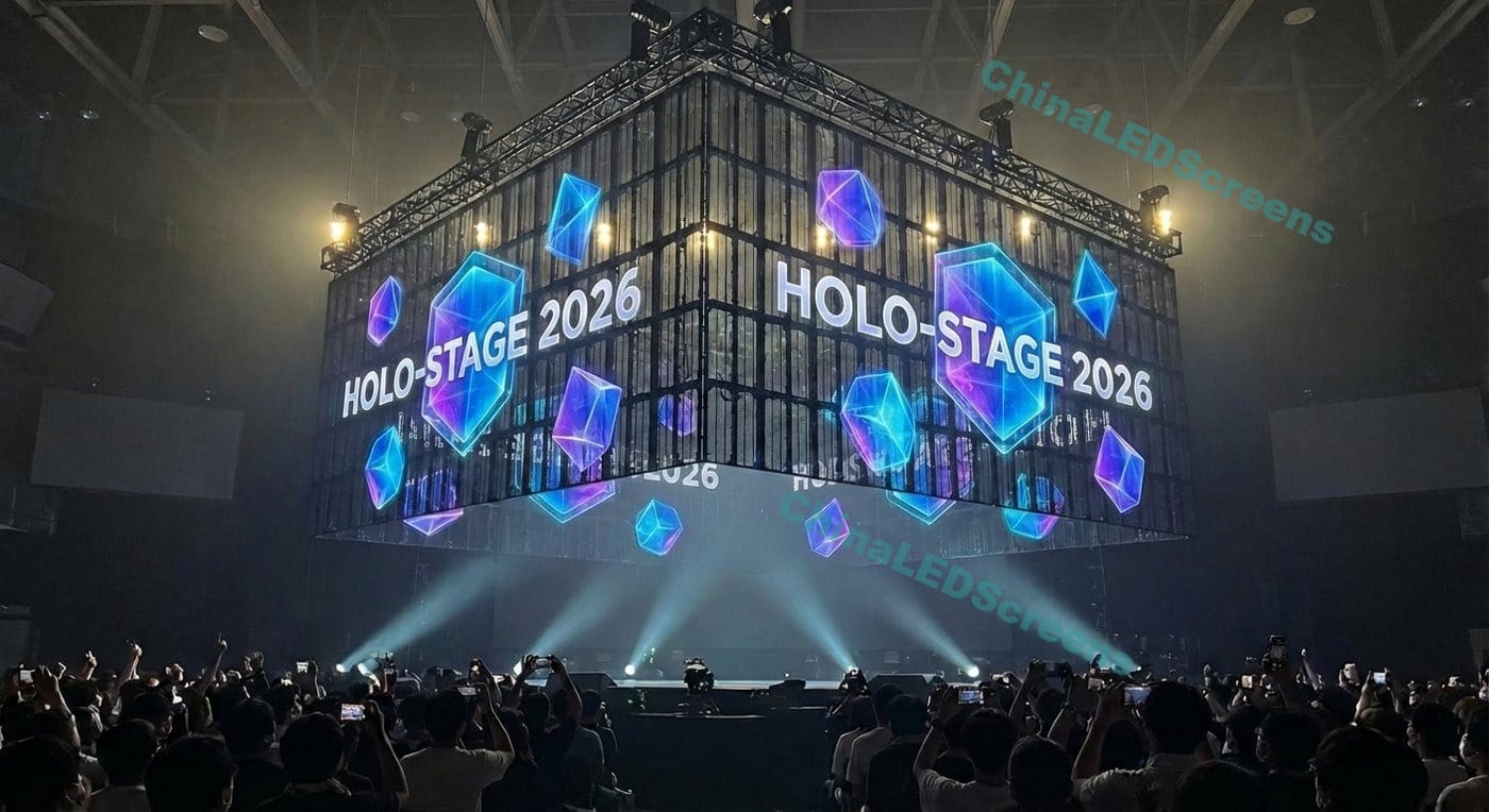
Scenario C: Events and stages (floating “holographic” effects)
For stage effects, viewers are normally farther:
closest viewers: 5–10 m
typical: 10–30 m
Recommended pitch:
P3.9–P6 is often sufficient
P3 only if it’s a premium close-range stage or VIP viewing area
Brightness: why “2,500–4,000 nits” often makes sense
Many buyers think brightness is only about “beating sunlight.” In practice, brightness is also about:
contrast (readability),
color saturation in ambient light,
and thermal/power constraints, especially in compact installations.
For holographic LED screens:
You often show high-contrast content (bright object on dark background).
You don’t always need extreme brightness, because you’re not trying to fill an entire solid image like an outdoor billboard.
So, for mixed day/night use:
2,500–4,000 nits is commonly a practical target range
going to “extreme nits” only makes sense if your screen faces harsh direct sun and reflections cannot be controlled
Professional tip: If night-time viewing is important, ask for:
stable grayscale at low brightness,
smooth dimming,
and content that doesn’t wash out when brightness is reduced.
Viewing angles: what matters in the real world
Many specs say 160°+ viewing angles. In practice:
Wide viewing angles are necessary, but glass reflections and background brightness can reduce perceived readability long before viewing angle becomes the limit.
So treat viewing angle as:
a minimum qualification (avoid narrow-angle components),
not your primary method to guarantee visibility.
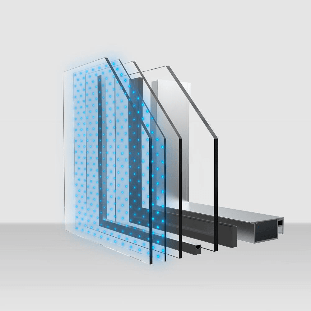
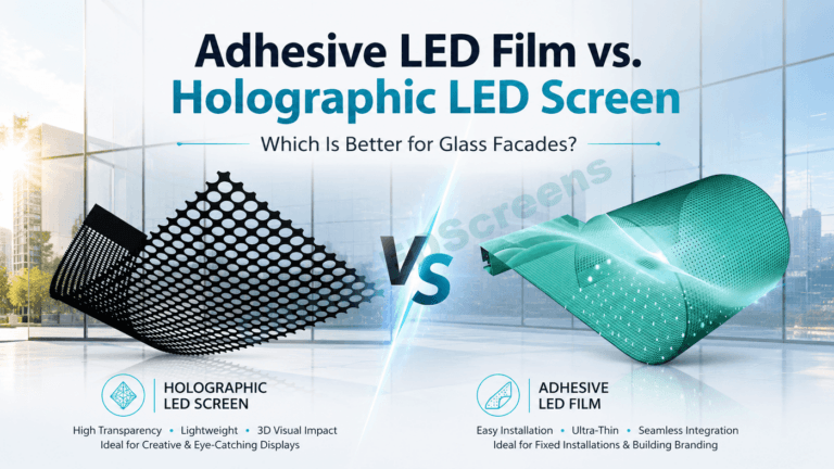
“Holographic” vs LED film vs LED glass: how the structure changes distance
Depending on the product architecture, the “pixel look” behaves differently.
Usually selected for façades or premium builds; viewing distance often starts farther back
Mesh / grille
Optimized for very large areas and long distances
Close-up viewing will show structure clearly (not ideal for close retail “readable text” needs)
Practical distance implication: The “more open” the structure, the more your content should rely on:
bold shapes,
thicker strokes,
slower motion,
and less fine detail.
Camera filming distance: don’t ignore this (even if the buyer didn’t ask)
If the screen will be filmed (events, social content, press), you need to treat viewing distance differently, because cameras reveal issues humans ignore:
moiré patterns (sensor grid vs LED grid),
flicker/banding (scan + shutter interactions),
edge shimmer (thin lines + transparency).
What to do:
prioritize high refresh and good low-gray performance,
avoid ultra-fine line content,
test with the actual camera type (phone, DSLR, broadcast).
When you’re specifying a holographic LED screen, the pitch-to-distance table is only the beginning. Final success depends on these checks:
1) Define your closest viewer (not your “average” viewer)
Your closest viewer sets:
minimum acceptable pitch,
content font size,
edge thickness rules,
and perceived quality.
2) Decide if you need “readable information” or “visual attraction”
If readable info matters → choose finer pitch and design content accordingly.
If pure attraction matters → you can go coarser pitch, and focus on brightness/contrast and content style.
3) Control reflections and background
If you can darken the background behind the screen, holographic effect improves dramatically.
If you cannot, you may need:
higher brightness,
better contrast,
and possibly finer pitch.
4) Validate maintenance and service strategy
Holographic screens are often installed in places that are hard to service (windows, suspended mounts, stage rigs). If rear access is restricted, front service and remote electronics become important design constraints.
5) Confirm power budget and thermal headroom
Especially for mobile or compact installs:
don’t spec “max nits” without knowing the thermal and power reality,
plan brightness schedules: day mode vs night mode.
Practical recommendations by application
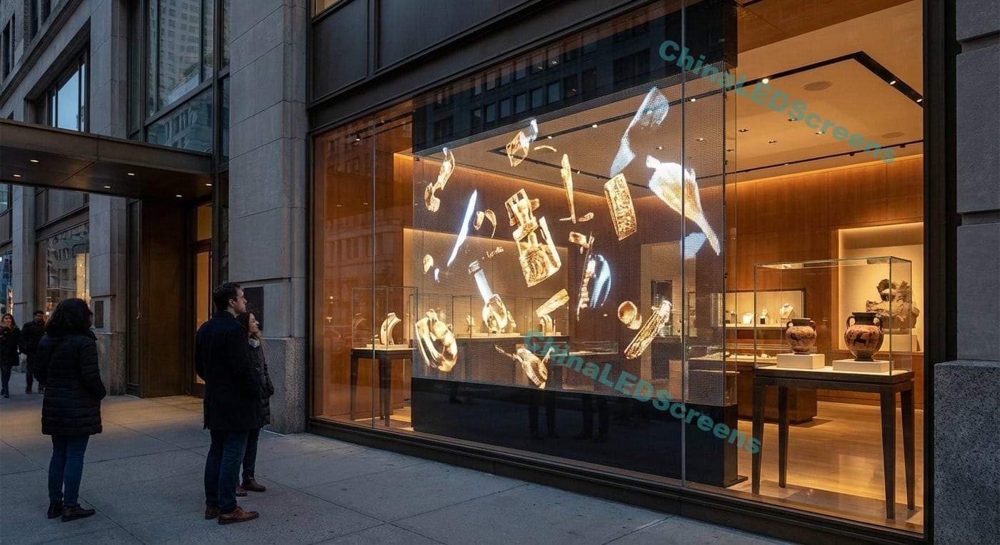
Retail storefront (pedestrian distance 2–10 m)
Best “balanced” range: P2.5–P3
If you must show text or QR codes: lean P2–P2.5
If it’s only floating visuals: P3–P4 can be fine
Museums / premium brand windows (controlled lighting)
P2–P2.5 can look extremely clean if viewers approach closely
Lighting control often lets you run lower brightness while keeping contrast strong
Events / stage floating effects (viewers 8–30 m)
P3.9–P6 is usually adequate
Spend budget on:
stability,
high refresh,
strong brightness uniformity,
and robust rigging
Mobile / vehicle-mounted installs (vibration, power, service access)
Even though this article focuses on “typical viewing distance,” mobile deployments deserve one extra note:
vibration tolerance and cable management matter as much as pitch,
power comes with real limits, so pick a pitch/brightness combo that keeps thermal stable,
plan service access because “small issues” become expensive if you can’t reach electronics quickly.
“If you only remember one thing…”
Choosing viewing distance for holographic LED screens is about matching pitch + content to the closest viewer, then protecting contrast (reflections/ambient light) so the floating effect stays crisp.
If you want to sanity-check how these choices show up in real installs, you can browse the visual references in Projects & Case Studies.