Content rules for storefront glass: motion, contrast, dwell time

Content rules for storefront glass motion, contrast, dwell time

Content rules for storefront glass: motion, contrast, dwell time

If you’ve ever approved a “beautiful” window animation in the studio and then watched it turn into a washed-out blur on the street, you already know the uncomfortable truth:

Storefront glass is not a normal screen environment. It’s a hostile optical battlefield—bright daylight, reflections, changing angles, and viewers who are literally walking away from you.

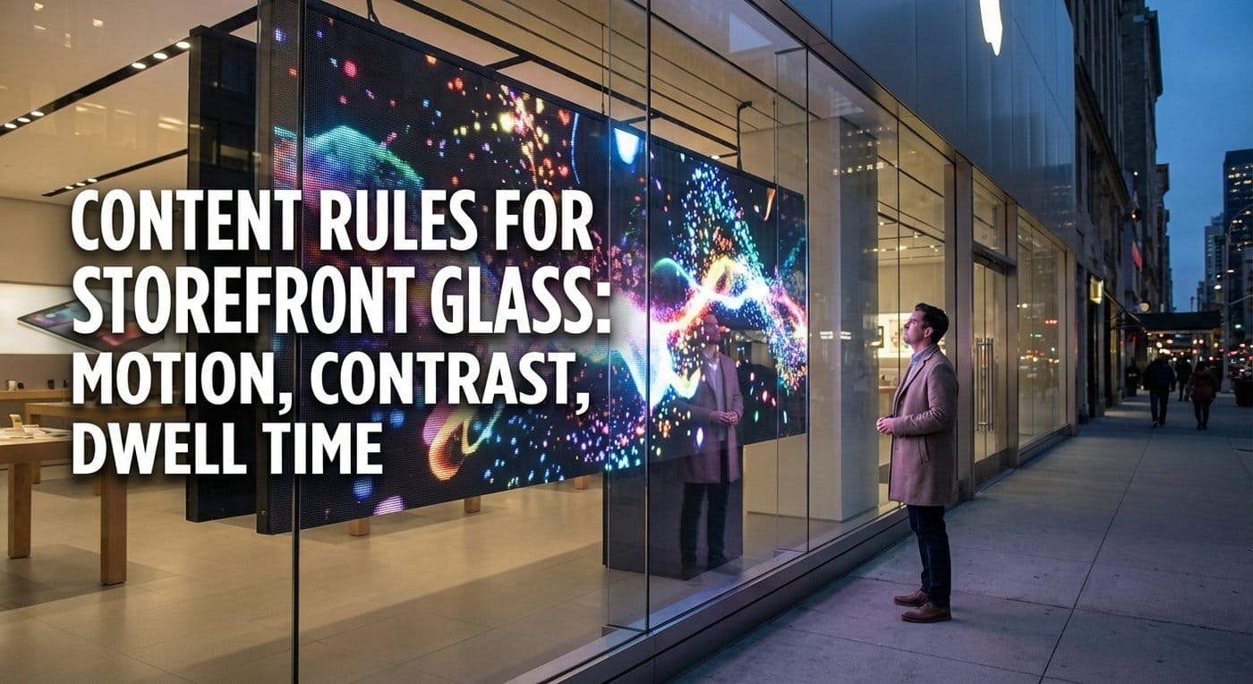
This guide gives you practical, field-tested rules for designing content that performs on storefront glass—especially for transparent LED screens and film-on-glass solutions—using three levers you can control:

  1. Dwell time (how long you realistically have)
  2. Motion (how you earn attention without noise)
  3. Contrast (how you stay readable against the sun)

We’ll keep it tactical, with templates and test protocols you can hand to your designer, your integrator, or your supplier.


Why storefront glass content fails (and what “good” looks like)

The daylight tax: you’re fighting ambient light

On a phone or indoor LCD, “contrast” mostly means the difference between bright pixels and dark pixels. On storefront glass, contrast is dominated by ambient illumination and reflections—because the viewer sees the screen plus the world mirrored on the glass.

That’s why black backgrounds are dangerous: your “black” becomes a mirror. ISO’s display ergonomics standards explicitly frame visibility around ambient illumination and minimum luminance required for recognizability. (iTeh)

What “good” looks like from the street

  • You can understand the message in one glance.
  • The content remains readable at multiple angles, not just straight-on.
  • Motion is controlled: it attracts attention, then stops being the story.
  • The design still works when reflections spike (cars, sky, sun).

The real attention window: design for 2–5 seconds

Real deployments repeatedly show that attention times can be short. A benchmark from Quividi reports an average attention time around 4.6 seconds, with some screens far lower and others much higher. Another benchmark report emphasizes that the first ~2.5 seconds matter disproportionately for recognition.

So the creative mandate is simple:

Assume you have 2–5 seconds. Build for instant comprehension.
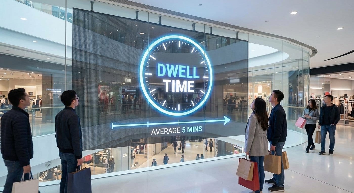
transparent led at Dwell time

Dwell time rules: design for drive-by viewing

Rule 1: Use a 3-layer message stack (Brand / Offer / Action)

A storefront viewer has three questions:

  1. What is this? (brand/category)
  2. Why should I care now? (offer/benefit)
  3. What do I do next? (action)

Your content should answer them top-to-bottom (or left-to-right) in one glance.

Practical stack

  • Layer A (0–1s): Brand + category cue (logo + 2–3 words)
  • Layer B (1–2s): One benefit or one offer (short, numeric if possible)
  • Layer C (2–5s): One action (visit, enter, scan, “today only”)

If you need a second message, don’t cram it into one screen. Put it in the next scene—but repeat the Layer A + B idea in both scenes.

Rule 2: Keep each scene “readable” in under 2.5 seconds

Because early seconds drive recognition most strongly, you should build scenes that stand alone quickly. (Eye Square下載)

Scene length recommendations

  • Scene duration: 2–4 seconds (default)
  • Total loop length: 12–20 seconds for most storefronts
  • Scenes per loop: 4–6 scenes

If you run longer loops, passersby will catch random slices and never get a complete story.

Rule 3: Repeat the core message more than you think you should

One of the cleanest findings in attention research is that small changes in exposure and repetition can materially change what gets retained. In a dunnhumby simulation, adding a second screen doubled dwell time (2.1s → 4.2s) and improved recall metrics. (go.dunnhumby.com)

You may not have two screens—so simulate the effect:

  • Repeat the same offer twice in the loop
  • Repeat the same product hero twice
  • Repeat the same CTA every scene (consistent location)

Motion rules: attract without annoying (or losing readability)

Rule 4: Motion’s job is to point, not to entertain

Window motion should behave like a spotlight:

  • A short movement that pulls eyes to the message
  • Then a stable frame that lets people read

If motion never settles, you create “visual noise.” People look away because the brain can’t resolve the information quickly.

Use motion in 3 safe places

  1. Entry motion: a quick reveal (0.3–0.8s)
  2. Pointer motion: subtle arrow/pulse toward CTA
  3. Micro-motion: slow gradient drift or tiny parallax behind text

Rule 5: Design for peripheral capture, central reading

Most passersby notice your window in peripheral vision, then glance directly only if something triggers them.

Best-performing pattern

  • A moving shape or bright object at the outer third of the canvas
  • The key message anchored in the center with stable typography

Rule 6: Avoid “flashy” motion and rapid flicker

Even if you aren’t thinking about regulations, rapid flashing is a bad idea:

  • It feels cheap
  • It reduces readability
  • It increases complaint risk

Keep it smooth. If you need urgency, use countdown UI (numbers) rather than strobing.

Rule 7: Use motion to increase contrast, not reduce it

Common mistake: designers put text over moving video backgrounds. On glass, that’s where legibility dies.

Better:

  • Put motion in a solid block behind text (a moving panel)
  • Or keep text on a static plate while the background moves slowly

Contrast rules: win against the sun

Rule 8: Stop thinking “contrast ratio” alone — think ambient contrast

A storefront viewer sees:

  • Your emitted light (screen brightness)
  • Plus reflected environment light (sun/sky/cars)

So the right question is:

  • Can my foreground still separate from my background under glare?

WCAG’s minimum contrast ratios (4.5:1 for normal text; 3:1 for large text) are a useful baseline for “readability math,” even though WCAG is for web. (W3C) But in storefront conditions, you usually need more than that baseline because reflections effectively reduce perceived contrast.

Practical storefront target

  • For critical text: design as if you need “WCAG AAA behavior” (stronger separation), even if you can’t compute perfect ratios in the field.

Rule 9: Use “contrast armor” recipes

These are repeatable design recipes that survive glare:

Recipe A: White/bright text + dark plate + outline

  • Put text on a dark, semi-opaque plate
  • Add a thin outline (stroke) around the text
  • Keep letterforms thick

Recipe B: Dark text + bright plate

  • For daylight windows, bright plates often outperform black backgrounds because black becomes a mirror

Recipe C: Two-tone text

  • Main keyword in bright color
  • Secondary words in neutral (white/light gray), but still separated

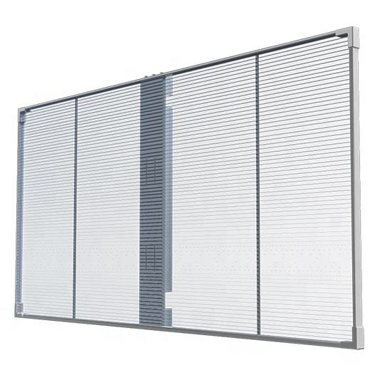
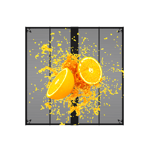
Rule 10: Respect transparent display artifacts (moiré, shimmer, thin lines)

Transparent LED and film solutions can produce artifacts when content includes:

  • Very fine repeating patterns
  • Thin diagonal lines
  • High-frequency textures (tight grids)

ISO display guidance discusses visibility of moiré patterns as a known artifact domain in display assessment. (iTeh)

Content-safe rules

  • Avoid 1–2 px “hairlines” and tight checkerboards
  • Avoid tiny text with sharp serifs
  • Prefer thicker strokes, larger type, simpler shapes

Readability rules: text size, distance, and message density

Rule 11: Size text using a defensible legibility index

If your storefront viewing distance is, say, 35–70 ft (10–20 m) from sidewalk-to-window and across the street, you need text sized for that reality.

Legibility research summarized by the U.S. Access Board describes a Legibility Index (LI) measured in feet per inch of letter height, with research suggesting ~35 ft/in accommodating average observers. (access-board.gov)

Quick sizing rule you can use in briefs

  • Letter height (inches) ≈ viewing distance (feet) / 35 (access-board.gov) Examples:
  • 35 ft → ~1 inch letters (minimum)
  • 70 ft → ~2 inch letters
  • 105 ft → ~3 inch letters

For storefront glass (with glare), add a safety margin: increase letter height by 20–40% for critical messages.
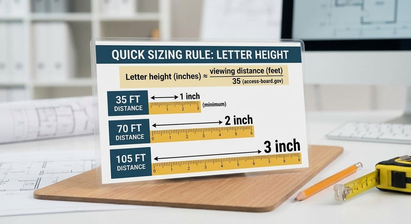
transparent led Quick sizing rule you can use in briefs

Rule 12: Write less. Then cut 30% more.

Because you’re designing for seconds, keep copy to:

  • 3–5 words for the main message
  • 0–2 “support words” (e.g., “today only”)
  • 1 CTA phrase

Bad: “Discover our premium winter collection available now” Better: “Winter Drop. 30% Off. Today.”

Rule 13: Fonts and spacing that survive glass

  • Use sans-serif with thick strokes
  • Increase tracking slightly (letter spacing)
  • Avoid condensed fonts unless very large
  • Keep line count to one line when possible (two max)

Content templates that work on storefront glass

Below are templates you can reuse across campaigns. They are designed to be readable fast and robust to glare.

Template 1: Product hero + one benefit

  • Left: product silhouette (high brightness)
  • Right: 3–5 word benefit
  • Bottom-right: CTA

Best for: fashion drops, electronics, seasonal launches

Template 2: Price-first offer (the “stopper”)

  • Big number (price or %)
  • Small qualifier (“select items”)
  • CTA (enter / scan / today)

Best for: conversions, foot traffic

Template 3: Countdown urgency (no flashing)

  • “Ends in: 02:14:33”
  • One offer line
  • CTA

Best for: time-bound promos; reduces need for aggressive motion

Template 4: Social proof / trust badge

  • “4.8★ rated”
  • “2,000+ reviews”
  • Brand lockup

Best for: new stores; credibility in seconds

Template 5: Wayfinding / “what’s inside”

  • 3 icons: coffee / Wi-Fi / seating (example)
  • One headline: “Inside: Fast + Cozy”
  • CTA: “Walk in”

Best for: cafés, clinics, services

Template 6: QR “rewarded scan”

Most QR codes fail because the incentive is unclear.

Use:

  • “Scan = free gift” or “Scan = 10% off”
  • Add a tiny note: “works in 5 sec”
  • Keep QR on a clean plate (high contrast)

Dayparting playbook: morning vs evening isn’t optional

Storefront glass changes radically across the day:

  • Morning sun angle
  • Midday brightness
  • Evening reflections + interior lighting

Dayparting rules

  • Morning / midday: brighter plates, fewer dark backgrounds, bigger type
  • Evening: you can use deeper blacks, but watch reflections from street lights and cars

Measurement & optimization: what to track (without overcomplicating)

What to measure

Start with 4 metrics:

  1. Opportunity-to-see / reach (people passing)
  2. Dwell / attention time (how long they look)
  3. Engagement proxy (QR scans, store entries, app opens)
  4. Conversion proxy (promo code redemptions, POS lift)

Why attention time matters: field benchmarks show attention can be only a few seconds on average, so creative improvements that add even 1–2 seconds are meaningful.
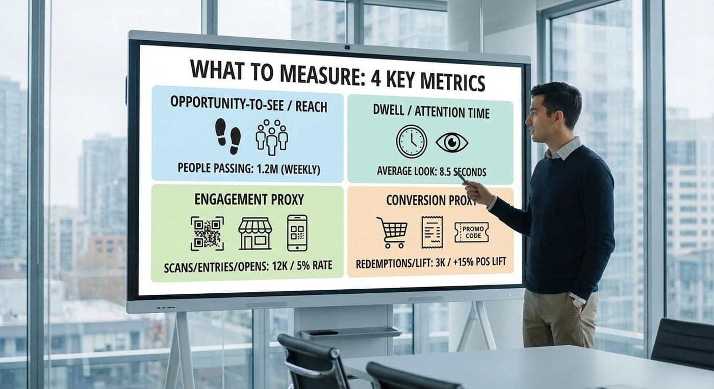
transparent led content What to measure Start with 4 metrics

A/B testing framework (simple, repeatable)

Test one variable at a time:

  • Motion: entry reveal vs no reveal
  • Contrast: dark plate vs bright plate
  • Message: price-led vs benefit-led
  • CTA: “Scan” vs “Walk in”

Run each variant for at least:

  • One sunny window (midday)
  • One evening window
  • One weekend block

Quick checklist: your storefront-glass creative brief

Creative checklist

  • [ ] One main message (3–5 words)
  • [ ] High-contrast plate behind text (or equivalent separation)
  • [ ] Motion settles into a readable frame
  • [ ] Text sized for real viewing distance (distance/35 rule)
  • [ ] No fine patterns / hairlines / shimmering textures
  • [ ] CTA repeats consistently across loop
  • [ ] Day/night versions (or auto brightness strategy aligned with site capability)

On-site test protocol (non-negotiable)

Test at:

  • Noon (worst-case glare)
  • Late afternoon (angle shift)
  • Night (reflections + interior)

Capture:

  • Photos/video from three angles
  • A short walk-by recording (what pedestrians actually experience)

If you want your supplier and integrator aligned on performance, anchor QA conversations in a “visibility under ambient illumination” mindset, consistent with ergonomics guidance for displays.


Closing: the storefront-glass “golden rule”

When you design for storefront glass, you’re not designing for a viewer who wants to watch.

You’re designing for someone who is:

  • moving,
  • distracted,
  • and looking through (and at) reflections.

So the winning system is:

  • fast message (dwell time reality),
  • controlled motion (attention without chaos),
  • contrast armor (readable under glare).

If you want examples of how these rules look in real deployments, review your internal references and benchmarks in the transparent LED display projects gallery , and align content constraints early with your supplier’s QA approach via transparent LED display technology .

Internal resources you may want nearby:
Comments

Blog Comments
Share your love