Talk To Our Expert, Get A Solution in 20 minutes
Share your LED screen needs. Our experts will provide solutions and a quick response.

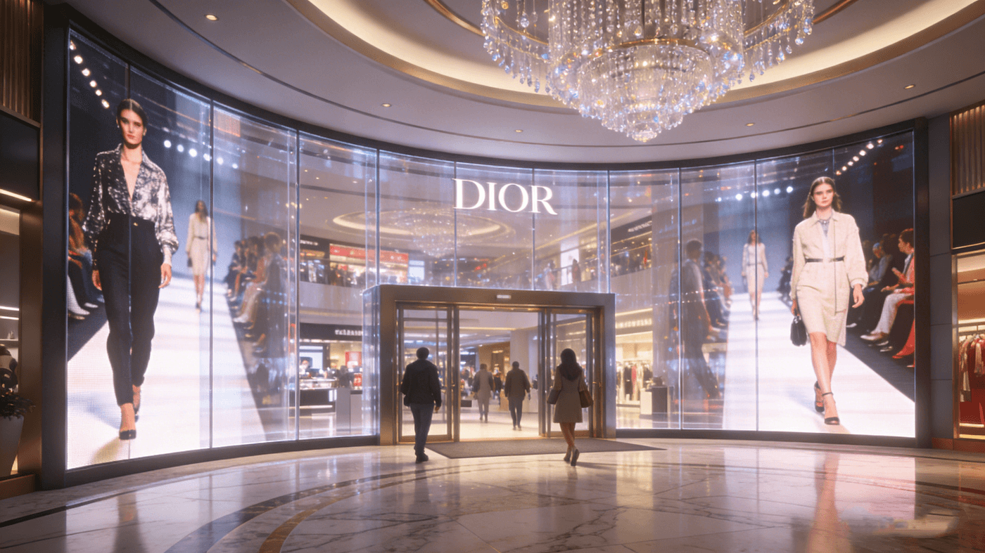
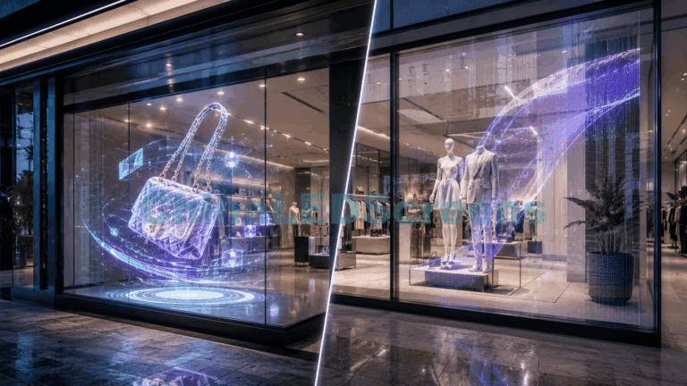
When an LED display moves onto (or behind) glass, “brightness” stops being a spec-sheet flex and becomes an optical engineering problem.
A normal wall-mounted LED screen fights ambient light once. A glass installation fights it twice:
That’s why two projects with the same “5000 nits” spec can look completely different in the real world.
This guide gives you the practical rules engineers, integrators, and architects use to predict readability—before the purchase order.
Most people think readability is: Display brightness ≥ Ambient brightness.
In practice, readability is driven by perceived contrast, not raw nits.
Your viewer’s eye is seeing:
So the real goal is:
Make the “ON” pixels stand out above reflections + background, while keeping “OFF” pixels truly dark.
That second part matters more on glass than on a wall. If your black level is lifted by glare, your bright pixels lose contrast even if the nits are high.
If you need a broader systems view of transparent products (cabinet-based vs film vs glass), see our transparent LED display guide : https://chinaledscreens.com/transparent-led-display-guide/ .
For glass installs, brightness must be defined as a control behavior, not a single maximum value.
Peak brightness is your “fight the sun” headroom. It matters for:
But peak brightness alone does not guarantee readability.
Many systems can hit a high peak but cannot sustain it due to:
For daylight readability, sustained brightness is what keeps you readable at 1–3 pm, not what you saw for 30 seconds during a demo.
At night, too much brightness creates:
A professional glass installation must dim smoothly and stay stable at low output—without flicker or color shift.
Here’s the mistake: using outdoor lighting (lux) directly to decide display nits.
Daylight doesn’t hit the viewer’s eye only as “ambient.” It becomes a reflection off the glass, and that reflected image competes with your content.
If you can measure illuminance on the glass (lux), estimate reflected luminance roughly as:
You don’t need perfect accuracy—what you need is the order of magnitude.
Typical glass reflectance varies by coatings and angle. The key is this:
If the reflected luminance is high, you need either higher LED luminance or better optical strategy (angle, placement, polarization, shading, content design).
This is exactly why “same nits” can win in one site and fail in another.
Glass failures often happen only during specific hours:
So treat brightness as a time-based requirement, not a constant.
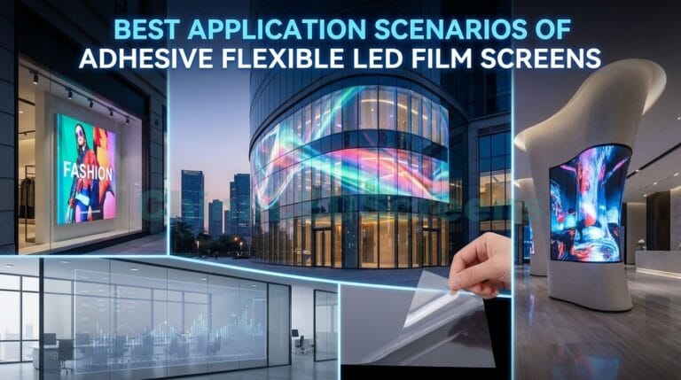
If you’re designing a retail-facing application, our retail window LED display reference page gives common use cases and constraints: https://chinaledscreens.com/led-for-retail-brand-experience/ .
Transparent systems win on architecture because they preserve daylight and visibility—but transparency changes the brightness math.
Why?
In other words:
A more transparent display usually needs more brightness headroom to look equally “solid.”
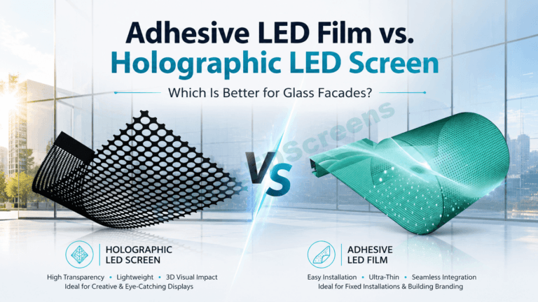
This is one reason film-based solutions and ultra-high-transparency mesh/grille solutions must be selected carefully.
If you’re comparing product families for glass integration, start with:

Below are starting ranges commonly used in projects. Treat them as planning baselines—final values should follow site measurement and mock-up validation.
Typical starting range: ~800–1500 nits Key risks: reflections from interior lighting, glossy floors, white walls Best strategy: moderate brightness + strong contrast content + good dimming
Typical starting range: ~1500–3000 nits Key risks: overhead glare, mixed viewing angles Best strategy: sustained brightness + anti-glare planning + content optimized for contrast
Typical starting range: ~2500–6000+ nits (site dependent) Key risks: direct sun hours, reflections dominate Best strategy: brightness headroom + content rules + placement/angle control
Typical starting range: ~5000–8000+ nits (project specific) Key risks: thermal, power, wind load, viewing distance Best strategy: system engineering (heat/power) + correct pixel pitch for distance + brightness scheduling
For façade-scale applications and planning by industry, our solutions hub can help you align specs with use cases: https://chinaledscreens.com/solutions/ .
Engineers often focus only on hardware brightness. But on glass, content is part of the optical system.
Transparent displays look best when you treat them like floating light, not like a solid TV.
A pro trick:
Run a brightness schedule:
This reduces thermal stress and improves perceived quality.
Glass is not a neutral window. It’s an optical filter.
This is why “install behind glass” must include:
If your project uses true LED glass integration, it’s worth reviewing the LED glass screen structure and lamination guide pathway: https://chinaledscreens.com/led-glass-screens-transparent-led-glass-guide/ .
Here’s professional language that prevents disappointment:
To show how we typically engineer these trade-offs (brightness vs power vs heat vs long-term stability), reference our technology and QC approach here: https://chinaledscreens.com/technology-quality/ .
If a glass display looks weak, it’s often one of these:
If blacks look gray, your contrast collapses. Solutions include:
The display starts bright, then dims itself. Fix is not “more nits,” it’s:
If the viewer stands close and the pitch is too large, the image looks sparse; the brain interprets it as “dim” even when the LEDs are bright.
If you’re starting the selection process, the cleanest entry point is the ChinaLEDScreens homepage (then branch by product family and application): https://chinaledscreens.com/ .