Talk To Our Expert, Get A Solution in 20 minutes
Share your LED screen needs. Our experts will provide solutions and a quick response.

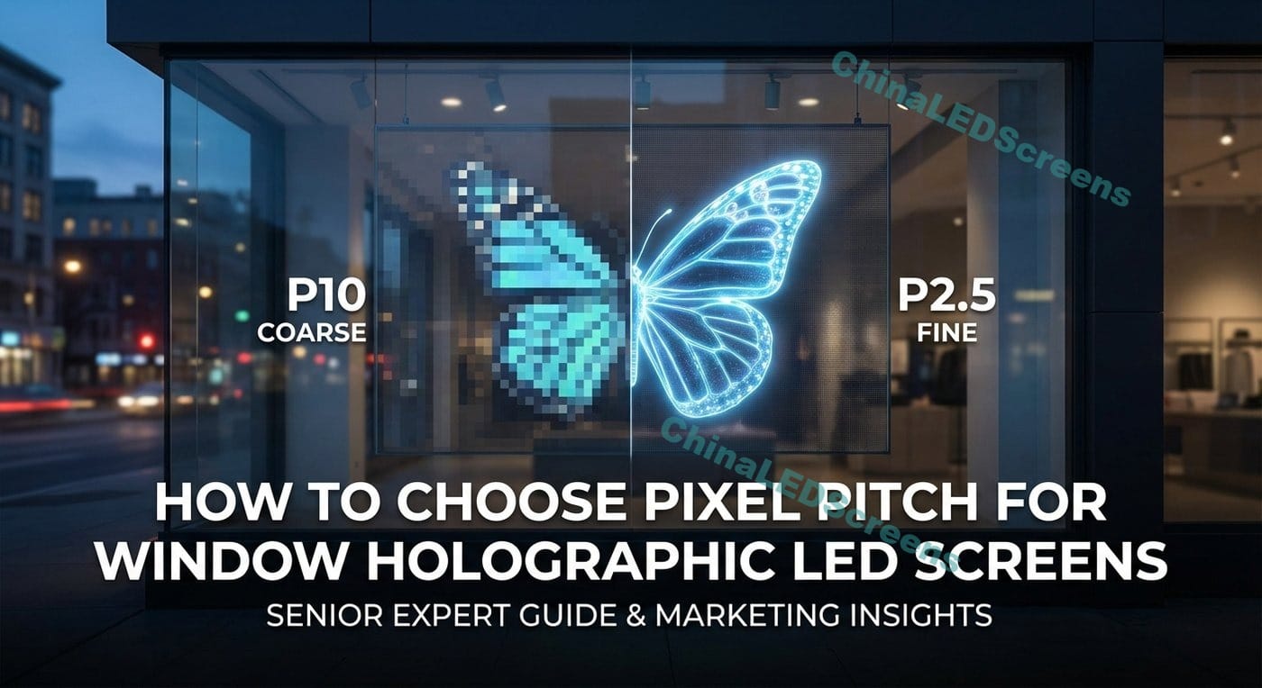
Window “holographic” LED screens are a special beast. You’re not building a solid LED wall in a dark room—you’re trying to create a floating visual layer on glass while still letting people see through the window (and letting daylight in). That means pixel pitch isn’t just an image-quality decision. It’s a business decision that affects transparency, perceived premium level, install complexity, and even whether your content looks like a hologram or just a noisy LED grid.
If you’re still aligning on product category terms, start with the category overview of holographic window solutions here: holographic LED screen For deeper concept + buying logic, the long-form guide is here: holographic LED screens guide 2025
Pixel pitch (mm) is the center-to-center distance between neighboring pixels. Smaller pitch means more pixels per square meter, which usually means:
But in a see-through window, smaller pitch also tends to mean:
So the correct pitch is the one that hits your real viewing distance and readability needs without sacrificing the window’s transparency purpose.
Here’s the most practical rule-of-thumb for LED displays in the real world:
Why it works: your eye stops separating individual pixels once each pixel subtends a small enough angle at your viewing position. A window display is usually judged from sidewalk distance, not from two inches away.
| Typical viewer distance (outside the glass) | What viewers do | Recommended pitch range | Why it’s the sweet spot |
|---|---|---|---|
| 1–2 m | stopping, reading, filming, selfies | P2.0–P2.5 | text edges and logos must hold up close |
| 2–4 m | slow walk-by, browsing | P2.5–P3.9 | balance: clarity + transparency |
| 4–8 m | normal sidewalk flow | P3.9–P5.2 | most common “retail window” range |
| 8–15 m | across the street / plaza | P5.2–P8 | big shapes/animations; maximize see-through |
| 15 m+ | long-distance landmark viewing | P8–P10+ | not typical for windows; more like façade media |
Practical takeaway: For most storefront windows, P3.9 or P5.2 ends up being the most rational choice—unless you truly need close-range text reading.
A lot of buyers choose pitch based on “looks sharp in a showroom demo.” The correct approach is: What must be readable from the sidewalk?
Text is the pitch killer. Transparent screens don’t forgive thin strokes.
Use these content rules (simple but powerful):
As a rough guideline for clean readability:
Be careful: window holographic screens rarely deliver “TV-like” detail because you’re trading away solid black backgrounds and full occlusion. If you truly need high-detail video, you might be asking a transparent medium to behave like a solid display.
In practice:
On a window, “better image quality” isn’t always better business. Ask: What is the window’s primary job?
You want the window to behave like a giant digital poster.
You want the brand to feel futuristic, but the store still looks open and bright.
If you want strong “holographic floating” perception, content style often matters more than pitch:
For broader background reading and selection logic on transparent products, this guide is a helpful companion: transparent LED display guide 2025
A simple calculation keeps you honest:
Horizontal pixels ≈ (screen width in meters × 1000) / pitch (mm) Vertical pixels ≈ (screen height in meters × 1000) / pitch (mm)
Example: a 3.0 m × 2.5 m window
| Pitch | Approx resolution (W×H) | Total pixels (approx) | What it feels like |
|---|---|---|---|
| P2.5 | 1200 × 1000 | 1.2M | close-range “premium signage” |
| P3.9 | 769 × 641 | 0.49M | strong retail window impact |
| P5.2 | 577 × 481 | 0.28M | best for big shapes / hologram content |
Now ask yourself: are you running 1080p video (1920×1080) on a screen that’s physically only ~769×641? If yes, you’re downscaling anyway—so you must design content accordingly.
This is why many window projects don’t benefit from ultra-fine pitch. You simply can’t use all that theoretical detail from where people stand.
Window displays fight reflections. Even with high nits, if reflections are strong and your content has low contrast, it will look washed.
What to do:
Pitch implication:
Direct sun on glass changes everything. You need a brightness plan:
Pitch implication:
Retail teams love filming window campaigns. Transparent LED grids can create moiré on cameras—especially if refresh/PWM/scan are not matched to the camera shutter.
Pitch implication:
Window projects fail when maintenance is ignored:
Pitch implication:
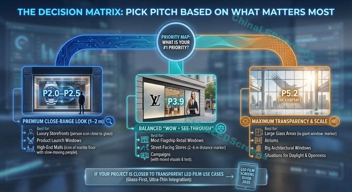
Use this “priority map” to decide quickly:
Choose P2.0–P2.5 Best for: luxury storefronts with people stopping right at the glass, product launch windows, high-end malls with slow foot traffic.
Choose P3.9 Best for: most flagship retail windows, street-facing stores with 2–6 m viewer distance, campaigns that mix brand visuals + simple headlines.
Choose P5.2 (or coarser) Best for: large glass areas where viewers are mostly 5–15 m away, atriums, big architectural windows, situations where the store needs daylight and openness first.
If your project is closer to transparent LED film use cases (glass-first, ultra-thin integration), this guide can help you align product category and expectation: LED film screens guide 2025
When you ask suppliers for quotes, pitch alone is not enough. Ask for:
Pro tip: ask them to demo your actual content style. Many demos look great because the content is optimized for the display and hides weaknesses.
If 95% of viewers are at 4–8 m, choosing P2.0 because “someone might stand at 1 m” is often wasted budget. Instead:
Transparent holographic windows shine with:
Glass reflections and sunlight can dominate perceived quality. Solve the environment with:
A screen you can’t service is a screen that will look bad after a year.
Before mass production or final contract:
If you want references to how window installs are typically executed across projects, browse your case gallery here: projects & case studies
No. Smaller pitch increases detail, but often reduces transparency and increases cost/power/heat requirements. For most storefront viewing distances, P3.9 or P5.2 is the smarter ROI unless you truly need close-range text reading.
Because thin strokes fall between pixels and because the transparent structure makes edges visually discontinuous. Fix it by:
The holographic feeling is driven more by content style (black background, floating objects, high contrast) than by ultra-fine pitch. In many window projects, P3.9 gives the strongest balance of holographic effect + transparency.