-
Address: Howay Tech Building, No.2 South 8th Keji Road, Hi-tech Park, Nanshan, Shenzhen
-
Email: chris@chinaledscreens.com
-
Website: https://chinaledscreens.com
How Holographic LED Screens Create Floating Visuals (Optical Principles)

How Holographic LED Screens Create Floating Visuals (Optical Principles)
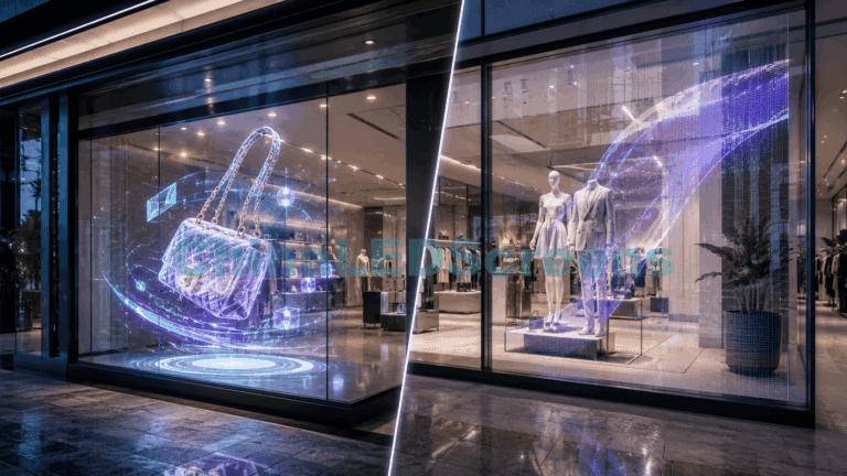
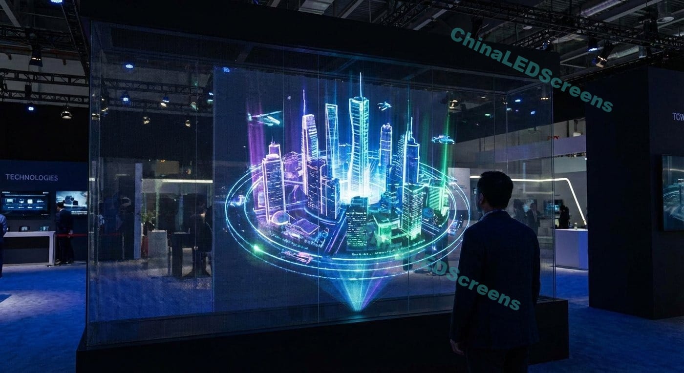
A “holographic LED screen” in commercial signage is usually not a true scientific hologram (wavefront reconstruction). In real-world retail, exhibitions, and events, what people call “holographic” is typically a high-transparency emissive LED structure—often a grid/mesh-style panel—mounted in a way that lets you see the real scene behind it while bright pixels appear to “float” in front.
That floating sensation isn’t magic. It’s the result of a layered optical system:
- Real background (what’s behind the display: store interior, products, street, architecture)
- Emitted light (what the LEDs add to the scene)
- Glass + reflections (what the glazing does to contrast)
- Human perception (how the brain interprets depth cues)
When these layers are engineered properly—especially content and lighting—the visuals feel like objects suspended in space. When they’re not, the same hardware can look like a faint overlay or “just a screen on glass.”
If you want product context while reading, you can explore:
- ChinaLEDScreens
- Holographic LED Screens
- Holographic LED Screens Guide 2025
- Transparent LED Screens
- LED Film Screens Guide 2025
- Projects & Case Studies
- Contact Us
1) What “Floating Visuals” Really Mean
1.1 It’s layered perception, not “3D holography”
When you look at a holographic LED screen, your eyes receive two image streams at the same time:
- Transmitted scene: the real world behind the display (through the transparent structure).
- Added light: the pixels emitted by the LED structure.
Your brain tries to separate these into layers. If separation is strong, the content appears to exist in front of the background—like it’s hovering. If separation is weak, the content “collapses” into the background and looks washed out.
So the fundamental question becomes:
How do we maximize perceptual separation between the emitted pixels and the real background?
That answer is about contrast, edges, motion, depth cues, and environmental control.
1.2 The “black is transparent” rule
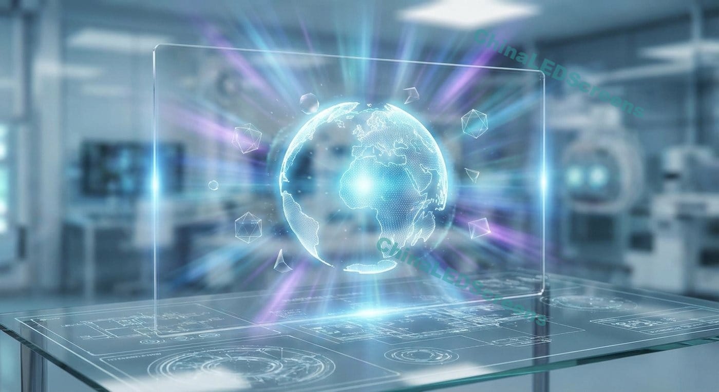
On transparent emissive displays, “black” usually means no light emitted. Unlike LCD, there’s no backlight to block. So a black background is effectively:
- Maximum transparency
- Maximum emphasis on the parts that do emit light
This is why most convincing “holographic” content uses:
- very dark backgrounds
- isolated bright objects
- minimal full-frame imagery
If you render a bright full-screen ad, you’re competing with daylight, reflections, and the real scene behind the glass. If you render a dark background with bright objects, you’re letting the environment do half the work.
1.3 The illusion depends on contrast at the edges
The human visual system is extremely edge-sensitive. We detect object boundaries first, then fill in the rest. Floating visuals become believable when:
- edges are clean and high-contrast
- shapes are simple and recognizable
- motion is smooth and intentional
If edges are noisy (busy background, reflections, tiny details), the “object” fails to separate from the scene.
2) The Optics Foundation: Transmission and Reflection on Glass
Even if the holographic LED screen itself is transparent, most installations involve glass (storefront glazing, curtain walls, display cases). Glass introduces two critical behaviors:
- Transmission: lets you see the real scene behind it
- Reflection: returns ambient light back to the viewer
2.1 Why reflections can destroy the floating effect
Reflections raise the perceived brightness of the “background layer.” In optical terms, they reduce effective contrast. In practical terms:
- A bright reflection on the glass is like a “white fog” on the image.
- Fine details disappear first.
- Floating visuals become flat and weak.
That’s why a holographic LED display that looks amazing at night can look underwhelming at noon—unless you treat reflection control as part of the system.
2.2 The real project is “display + glass + lighting”
Think like an engineer:
- The display provides emitted light (your controllable layer)
- The glass introduces reflections (your enemy)
- The lighting controls the environment (your leverage)
In premium projects, the floating effect is achieved not only by hardware, but by managing the entire optical stack.
3) The Perception Stack: Why Your Brain Believes It’s Floating
“Depth” can be suggested without true 3D. The brain uses multiple cues. Holographic LED exploits several of the strongest ones.
3.1 Motion parallax is the #1 depth amplifier
Motion sells depth. If an object moves cleanly while the real background remains stable, the brain interprets the object as a separate plane.
Even simple motion techniques can create strong “float”:
- slow drift
- rotating product silhouettes
- particle fields with layered speeds
- objects moving “toward” the viewer via scale + perspective
Static images can work, but motion dramatically increases the 3D-like impression.
3.2 Figure-ground separation
This is the psychology of “what is the object” vs “what is the background.” For floating visuals:
- The object must be visually dominant
- The background must be visually quiet, or at least not competitive
- The content must avoid visual ambiguity (thin lines, noisy textures)
This is why bold shapes outperform complex photos in storefront daylight.
3.3 Occlusion cues (fake them and you win)
Occlusion is a powerful depth cue: if one object passes in front of another, the brain immediately constructs a depth relationship.
Even on a transparent display, you can simulate occlusion by:
- layering elements
- masking parts of an object
- using foreground particles passing “in front” of a hero object
- animating “reveal” events (object emerges from darkness)
These are not expensive tricks. But they are high-impact.
4) The Unavoidable Triangle: Transparency vs Brightness vs Resolution
No transparent display can maximize all three simultaneously:
- Higher transparency means more open area (less physical material, fewer emitters)
- Higher resolution usually means denser structure (more material, more emitters)
- Higher brightness demands power and thermal capability (and can increase glare perception)
This is why “floating visuals” are not purely a hardware spec. They are a system optimization based on your KPI:
- Do you need maximum openness and a “ghost-like” illusion?
- Do you need sharper detail at close range?
- Do you need stronger daytime presence?
4.1 Pixel pitch changes how the illusion feels
Pixel pitch affects:
- structure visibility
- detail rendering
- optimal viewing distance
At close distance, a coarse structure looks like a grid. At proper distance, your vision integrates it and the content becomes the hero.
4.2 Viewing distance determines when the structure “disappears”
For real-world planning, ask:
- How close will viewers stand? 0.5 m? 2 m? 5 m?
- Is this a sidewalk window, a showroom interior, or a stage?
A design that looks magical from 3–8 meters may look “technical” from 0.5–1 meter. The solution isn’t always “smaller pitch.” Sometimes it’s changing the content and background strategy.
5) Why Some Holographic LED Installs Look Incredible—and Some Don’t
The difference is usually not the LEDs. It’s the scene.
5.1 Daylight and reflections flatten depth
If the environment is bright and reflective:
- the background becomes too dominant
- edges lose contrast
- floating becomes weak
Fixes include:
- better content strategy (more negative space, brighter silhouettes)
- changing the viewing angle and placement
- controlling lighting (especially front reflections)
- designing around day/night behavior with different playlists
5.2 Busy backgrounds kill legibility
If behind-glass scenery is cluttered (shelves, signage, people moving), the digital layer loses separation. You can’t rely on subtle gradients or thin typography.
In these environments, the winning content is:
- large objects
- slow motion
- thick edges
- reduced detail density
- strong luminance contrast
5.3 “Screen-like” content breaks the illusion
If you treat a holographic LED like a TV, you get TV problems:
- full-screen images look washed out
- text becomes hard to read
- the effect stops feeling “holographic”
The “holographic” style needs content designed for transparency.
6) Moiré, Aliasing, and Camera Artifacts (What They Are and How to Reduce Them)
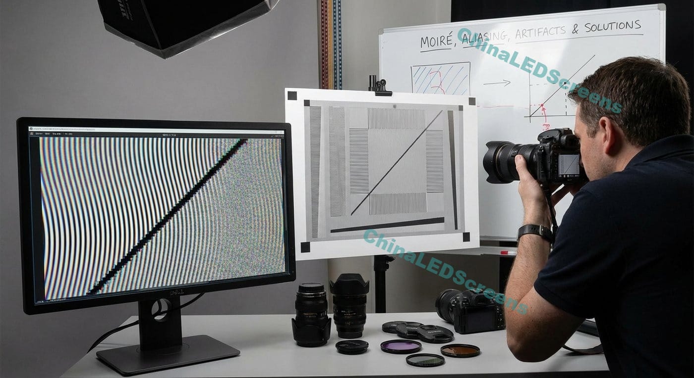
Transparent LED structures are inherently periodic (grids/lines). Cameras and backgrounds often contain periodic patterns too. That’s a recipe for artifacts.
6.1 Moiré: the repeating-pattern conflict
Moiré happens when:
- the display structure pattern interferes with
- another repeating pattern (camera sensor sampling, blinds, shelves, textiles)
In person, moiré can appear as shimmering or strange pattern waves. On camera, it can be even worse.
How to reduce moiré risk:
- avoid high-frequency content (thin stripes, tight checker patterns)
- avoid thin typography in daylight windows
- use bolder shapes and gradients
- test content on-site with real backgrounds
6.2 Rolling shutter + LED scanning can cause banding on video
If clients want to film the display for social media, you must consider:
- driver strategy
- refresh and scan behavior
- camera shutter settings
Operationally, the key is to treat “camera readiness” as a requirement—not an afterthought.
6.3 The best moiré strategy is content discipline
If you want the floating effect, you should already be using:
- large silhouettes
- slow movement
- minimal fine detail
That same content style also reduces moiré and camera complaints.
7) Content Design Rules That Make Floating Visuals Look Real
If you remember one line:
Floating visuals are primarily a content and scene design problem.
7.1 The five rules that work almost everywhere
- Use black/dark backgrounds (let the world show through)
- Use negative space (give objects air)
- Use bold silhouettes (simple object language)
- Use controlled highlights (rim light style looks “3D”)
- Use motion (parallax layers, reveal, rotation)
7.2 Build depth using 2.5D staging
You don’t need stereoscopic content. You need believable staging:
- Foreground particles move faster
- Mid-layer objects move moderately
- Background accents move slow
- Objects scale slightly as they move (suggesting approach)
- Occasional occlusion events reinforce depth
This is “cheap depth,” but it’s extremely effective.
7.3 Typography: less is more
Text is not forbidden, but it must be designed for transparency:
- large type
- high contrast
- minimal copy
- short phrases
- avoid thin fonts and dense paragraphs
For storefronts, consider text only at the beginning/end of an animation loop, not continuously.
7.4 Day and night playlists are different products
Treat a storefront as two venues:
- Daytime: brighter ambient, more reflections, background dominates
- Nighttime: background recedes, pixels dominate, richer visuals possible
Best practice:
- Day playlist: strong silhouettes, minimal detail, short loops
- Night playlist: richer color, longer narratives, deeper effects
8) Environmental Engineering: Make the Venue Work for the Display
8.1 Control what you can control: reflections and contrast
Practical levers:
- adjust front lighting angles
- reduce direct glare sources
- position the display to reduce reflective hotspots
- ensure content is high-contrast for the environment
Even small reflection improvements can create a big jump in perceived “holographic” quality.
8.2 Background selection is part of the spec
Ask early:
- what is behind the display during the day?
- during the night?
- will there be people moving behind it?
- will there be bright shelves, reflective product packaging, or mirrors?
If the background is chaotic, you must design content accordingly.
8.3 Glass type and glazing stack matter
Different glazing conditions change:
- reflectance
- ghost reflections (multiple panes)
- perceived contrast
- optical clarity
A design that works on single glazing might behave differently on double glazing. Plan for it, and test.
9) A Practical “Floating Visuals” Checklist for Buyers
This section is written for project owners, architects, integrators, and brand teams who want predictable results.
9.1 Pre-purchase demo checklist
Insist on testing under your real conditions:
- daytime viewing at the actual window orientation
- nighttime viewing
- typical viewer positions and distances
- test content similar to your brand’s style
- camera test if filming matters
9.2 Define success metrics upfront
Pick the KPI:
- Footfall capture (stop-and-stare power)
- Brand storytelling (premium visual language)
- Product explanation (information clarity)
- Architectural impact (media façade intent)
Holographic LED floating visuals are strongest when the KPI is impact, not dense reading.
9.3 Plan maintenance and service access early
A transparent install becomes painful when service was ignored:
- access points
- module replacement workflow
- spare parts plan
- cleaning and inspection schedule
- acceptance criteria for uniformity and pixel defects
If you want examples of how these considerations show up in real deployments, review:
10) How to Choose the Right Transparent Display Family for Floating Visuals
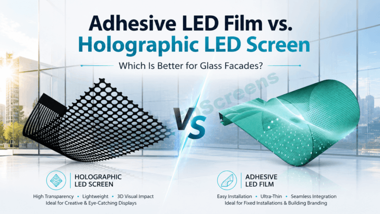
“Holographic LED screen” is often one category in a broader transparent-display strategy. In practice, brands also consider:
- transparent LED screens for large windows and architectural use
- LED film screens for ultra-thin glass integration concepts
- LED glass approaches for specific construction constraints
To guide your decision path:
The key is aligning:
- viewing distance
- daylight conditions
- desired transparency feel
- content style
- installation constraints
Conclusion: Floating Visuals Are Engineered Illusions
Holographic LED “floating visuals” are created by a simple but powerful concept:
- emit light into a scene
- while keeping enough transparency that the real world remains visible
- then use contrast, motion, and depth cues to separate the digital layer from the background
When you design for transparency—dark backgrounds, negative space, bold silhouettes, and layered motion—the content stops looking like a screen and starts looking like objects suspended in space.
If you want a project-specific recommendation (daylight vs indoor, viewing distance, glass type, content style), start here: