Talk To Our Expert, Get A Solution in 20 minutes
Share your LED screen needs. Our experts will provide solutions and a quick response.

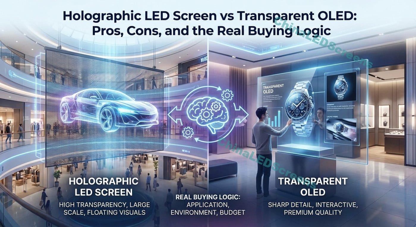
Transparent displays sell a dream: turn glass into media without “closing” the space. But when a buyer searches “holographic LED screen vs transparent OLED: pros and cons”, they’re usually not looking for a generic list—they’re trying to avoid an expensive mismatch.
In practice, you’re choosing between two very different philosophies:
Below is the professional decision framework I use on real projects, plus a comparison matrix, use-case recommendations, and procurement pitfalls.
Table of Contents
Choose Transparent OLED if you need:
Choose a Holographic LED screen if you need:
If you’re still undecided, jump to “Use-case fit map” and “Engineering checklist.”
Transparent OLED is self-emissive and can look extremely refined at close range. But it comes with physical realities that show up in specs and operations. For example, LG’s transparent OLED signage lists 43% transparency and brightness around 200/600 nits depending on APL (measurement conditions matter), and operational guidance like 18/7 (moving content only) with a lifetime figure around 30,000 hours on at least one commercial listing.
That immediately tells you:
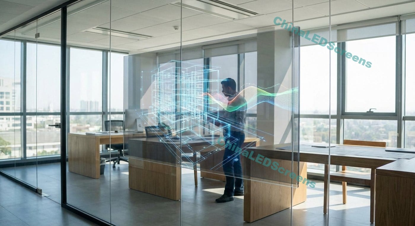
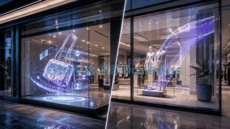
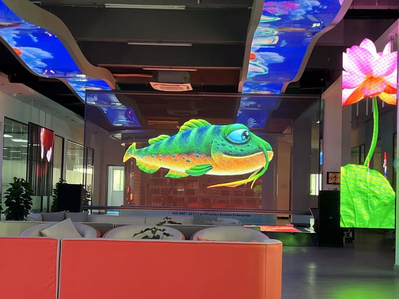
Most “holographic LED screens” in transparent-display projects are LED structures designed to keep a large percentage of open area so content appears to float. Transparency often depends on design and pixel density; industry comparisons commonly describe ranges like ~60–90% depending on structure and pitch.
This is why holographic LED often wins when the buyer’s goal is:
If you want to explore product directions for your site visitors, you can route them to your category hub: ChinaLEDScreens.
| Dimension | Holographic LED Screen | Transparent OLED |
|---|---|---|
| Transparency feel | Often higher “open” feel (design dependent) | Typically around the ~37–43% class in commercial transparent OLED listings |
| Brightness in ambient light | Generally stronger presence; LED-based transparent systems can reach much higher brightness ranges in the category | Typically lower brightness class (often a few hundred nits under certain APL conditions) |
| Close-up resolution | Usually lower than OLED at near distances (pitch-limited) | Strong for close viewing (text, detail) |
| Scale / size | Can be conceptually scalable for larger areas (project-dependent) | Panel format constraints; video wall possible but fixed units |
| Seam / bezel | Can be designed to minimize visual obstruction, but structure remains | Bezel/seam management matters (panel edges, layout) |
| Reliability risks | LED module serviceability is a plus; design quality matters | OLED aging/image retention must be managed (mitigations exist) |
| Best environments | Retail windows, events, staged “floating” effects | Luxury retail, museums, showrooms, controlled lighting |
| Best buyer intent | “Wow effect + transparency” | “Premium image + close-up clarity” |
1) The “floating content” effect is naturally strong Because there is more open area and content points can appear suspended, holographic LED can deliver the visual trick people want—without glasses, without AR apps.
2) Better tolerance of ambient light (in the category) Transparent LED technologies are often positioned as higher-brightness options compared with transparent LCD/OLED approaches, and industry references commonly cite transparent LED brightness ranges reaching into thousands of cd/m² depending on product type. That matters in storefronts where sunlight is not a polite guest—it’s a bully.
3) Flexible storytelling for brand windows Holographic LED is extremely effective for “hero moments”: product reveals, seasonal launches, limited drops, art collaborations. It’s not about reading paragraphs. It’s about stopping feet.
If you want to show buyers adjacent options that solve different glass constraints, route them to:
4) Easier service logic when well-designed LED systems are built for service workflows: modules, power, receiving cards. If planned correctly, maintenance is a process, not a crisis.
1) Not a “phone screen on glass” experience When the buyer expects close-up micro-detail (fine text, UI elements), OLED usually looks cleaner.
2) Transparency trades against resolution Higher resolution typically means denser LED structure, which can reduce the “open” feeling.
3) Engineering quality varies wildly Poor designs create issues: uneven brightness, moiré with cameras, visible structure, unstable controllers, messy wiring. This is why factory process + QC matter for enterprise projects (and why case references help buyers feel safe).
Direct buyers to credibility assets:
1) Best-in-class close-range image quality Transparent OLED is the option you pick when people will stand 0.5–3 meters away and evaluate product detail, typography, and premium visuals.
2) High-end “designer finish” In luxury retail and museums, the aesthetic finish matters almost as much as the content. Transparent OLED often integrates beautifully into a curated interior story.
3) Mature ecosystem for commercial signage Commercial units include signage platforms and integration tooling. One transparent OLED listing highlights features like expandable design for video walls and compatibility with signage software platforms.
1) Transparency is not “invisible” Many commercial transparent OLED products sit around the ~37–43% transparency class. That can be perfect for a museum case, but disappointing if the stakeholder expects “almost nothing on the glass.”
2) Brightness constraints in demanding daylight Transparent OLED brightness figures are typically in the hundreds of nits depending on measurement conditions (APL). In bright storefronts, you may fight reflections and ambient washout unless you control lighting, add shading, or accept “daytime subtle, nighttime stunning.”
3) Content governance is non-negotiable OLED aging/image retention is real, but modern mitigations (pixel shifting, logo dimming, cleaning cycles) make it manageable when used correctly. For digital signage, the risk usually comes from static UI elements (logos, menus, fixed frames) and overdriving brightness without scheduling.
If you sell across window types, it helps to guide readers through your transparent product family pages:
These spaces have mixed lighting and large viewing distances. The winner depends on:
For buyers in these verticals, route them to solution pages for planning context:
Holographic LED is usually the practical winner because:
| Question | If “2” points… | Technology tends to win |
|---|---|---|
| Viewers stand < 2m away and read text | Detail + typography matters | Transparent OLED |
| Window is sun-exposed most of the day | Ambient washout risk is high | Holographic LED |
| You need the most “open glass” feeling | Transparency is a primary KPI | Holographic LED |
| You need premium, gallery-like finish | Industrial design priority | Transparent OLED |
| You expect future scaling to larger areas | Modular growth path matters | Often LED approaches |
| Static logos / UI will be on-screen all day | Governance is difficult | Lean LED, or enforce OLED safeguards |
| Spec signal | What it means in the real world |
|---|---|
| Transparency % | High % helps sightlines; but the “feel” also depends on structure, pixel density, and reflections |
| Brightness (nits) | Critical for daytime readability; also increases thermal and power design requirements |
| APL conditions (OLED) | Brightness depends on average picture level; full-white and small highlights behave differently |
| Duty rating (e.g., 18/7) | Tells you expected commercial operation patterns; match it to venue hours |
| Lifespan hours | Useful for planning replacement cycles and TCO, but depends on brightness and content behavior |
A buyer asking “pros and cons” is often trying to anticipate hidden costs:
Transparent displays punish lazy content.
This is why we always recommend showing buyers references early:
Higher transparency usually means fewer emitting elements blocking the view. But fewer emitters can reduce perceived brightness or detail unless you redesign the system. This trade shows up across transparent display categories.
Many “visibility complaints” are actually optics complaints:
Treat the glass as part of the display stack.
Modern OLED burn-in fears are often exaggerated for typical mixed content, but signage is not “typical” if you run static elements all day. Best practice is governance: rotation, dimming static UI, maintenance cycles.
Whether you choose holographic LED or transparent OLED, the winning content traits are similar:
If you want to move readers from comparison to action, a strong next step CTA is to offer an engineering consult:
Transparent OLED is a precision instrument: premium, close-range, controlled lighting, strong image quality. Its limits (transparency class, brightness, duty guidance) are not flaws—they’re design boundaries shown plainly in commercial specs.
Holographic LED is a visual weapon: more “open” feeling, floating impact, stronger presence in mixed lighting, and more flexible installation concepts—especially when your goal is to turn glass into attention.
If you want, I can also turn this comparison into: