Sprechen Sie mit unserem Experten und erhalten Sie innerhalb von 20 Minuten eine Lösung.
Schildern Sie uns Ihre Anforderungen an LED-Bildschirme. Unsere Experten bieten Ihnen Lösungen und reagieren schnell.

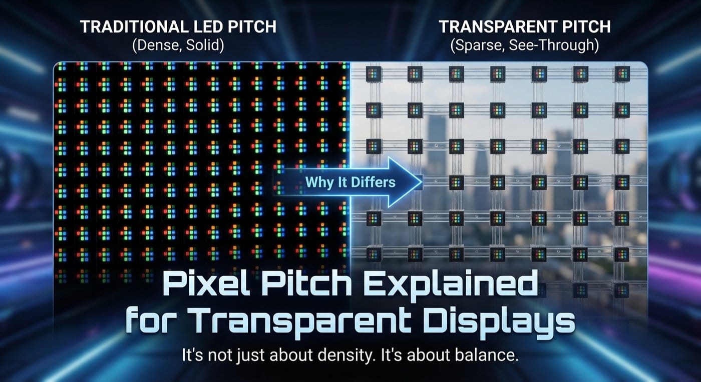
If you’ve bought conventional LED walls before, pixel pitch feels straightforward: smaller pitch = higher resolution = closer viewing.
Transparent displays break that mental model.
On “media glass” projects, pixel pitch is not just a resolution choice—it’s a visibility vs impact decision that interacts with transparency, brightness strategy, building structure, and even how the human eye blends light points when there’s daylight behind the screen.
This article explains what pixel pitch means for transparent systems, why spec sheets can be misleading, and how engineers and integrators choose a pitch that works in real architecture.
Pixel pitch (mm) is the center-to-center distance between two neighboring pixels.
For a traditional LED wall, that implies a dense 2D grid—so pitch directly predicts:
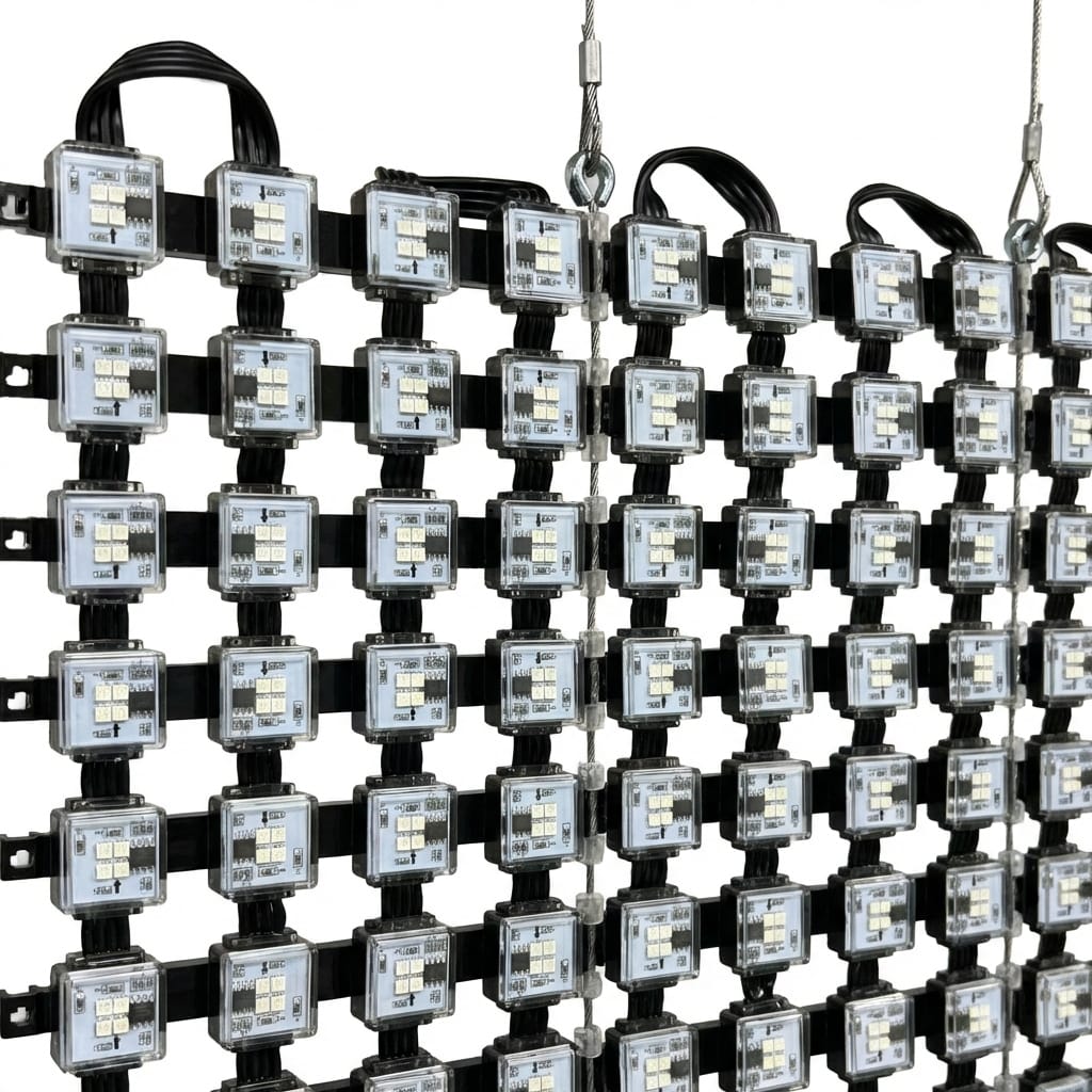
For transparent displays, the pixel “grid” is often not a uniform grid. Many transparent products are strip-based or bar-based, with open gaps designed to preserve sightlines. That changes everything:
If you’re new to the overall product families (transparent screens vs film vs glass vs mesh), use your categories overview as a quick map: transparent LED display product categories.
Transparent LED is a controlled compromise: you are removing emitters (open area) to keep visibility and daylight.
That means a transparent display with “similar pitch” to a solid LED wall often does not behave the same because:
So in practice, pitch selection must be tied to the brightness plan Und content style, not resolution alone.
Many transparent products are expressed as P(x) × P(y) (e.g., a tighter horizontal sampling but looser vertical sampling, or vice versa). Even when a spec sheet shows a single “P value,” the underlying geometry may be directional.
What that does in real content:
On a transparent façade, viewers are often farther away (street, across a plaza, opposite building). At those distances, you can use larger pitch because the eye blends pixels.
But retail windows can be very close. A pitch that looks great at 15–30 m can look coarse at 2–5 m.
Architectural constraints matter more for transparent screens than for indoor walls:
If the structure creates strong vertical/horizontal lines, it can visually “overpower” the pixel grid and make the pitch feel larger or uneven.
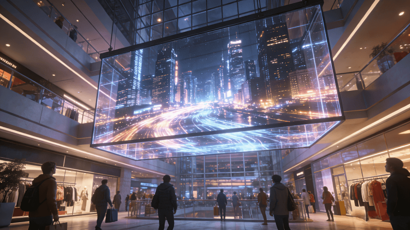
When comparing vendors, don’t settle for a single pitch number. Ask for:
The actual pixel-to-pixel spacing of the product.
A practical description of how the image reads at your required distance under your ambient light conditions.
A vendor doesn’t need a perfect scientific model for perceived pitch—but they should be able to show:
For a structured checklist approach (especially useful when you’re writing RFQs), this guide is a strong internal reference: transparent LED display specification checklist.
A common field shortcut is:
Minimum comfortable viewing distance (m) ≈ pixel pitch (mm)
So P10 is comfortable from ~10 m; P3 from ~3 m, etc. (This is a rule-of-thumb, not a law.)
For transparent displays, the “comfortable distance” depends heavily on:
Practical implication:
If you want to connect pitch decisions to brightness strategy properly, anchor your team on this internal guide entry: transparent LED display pixel pitch and brightness guide.
These are often used for retail windows and scalable architectural installs where serviceability matters. Your real-world pitch choice is usually shaped by:
If you’re quoting or comparing this product family, use: transparente LED-Bildschirme.
Film products change pitch behavior because they’re designed to stay visually “light” and unobtrusive. Pitch selection here often trades against:
A deeper selection baseline is here: LED film screens guide.
When the display is structurally integrated into glass, pitch isn’t just optical—it impacts:
That’s why “best pitch” in LED glass is often the pitch that fits the glass engineering, not the smallest number on paper. Reference: LED glass screens transparent LED glass guide.
Curved glass adds a subtle pitch effect: curvature changes how pixels align to the viewer, and it changes reflections. You may need to relax pitch or redesign content to avoid visible stepping and distortion on tight curves. Planning guide: selbstklebende flexible LED-Folienführung.
Mesh systems are often selected when the real requirement is:
Here, “good pitch” is the pitch that matches viewing distance and façade scale—not indoor-style fine detail. Use this guide for selection logic: Maschen-LED-Anzeigen flexible Maschenvorhangführung.
Buying the smallest pitch you can afford often fails on transparent installs because it can force:
The client often ends up saying: “It looks less transparent than we expected.”
Video content tolerates larger pitch surprisingly well (especially at distance). Text and pricing does not.
If the main use is price tags, menus, or dense messaging: don’t pretend it’s a façade billboard use case.
On a window or glass wall, background daylight can reduce contrast. Larger pitch can still work—but your content must be designed for transparency:
Directional pitch can make certain patterns look fine and others break badly. If your audience walks along a street frontage, the viewing angle changes continuously—directional artifacts become more obvious.
Even if a module’s pitch is tight, the installed system may introduce:
That can create an “effective pitch” that’s worse than the native product pitch.
Use this sequence with architects + integrators + buyers:
Pick one primary:
Transparent screens vs film vs glass vs mesh all change what “good pitch” means. Use the product-family overview to align everyone early: transparent LED display product categories.
You rarely maximize all three. In practice:
Even if your primary content is video, run one test: your smallest required text size at the closest viewing distance. If it fails, don’t “hope.” Adjust pitch or adjust the content spec.
If you need one internal place to anchor pitch discussion with stakeholders, begin with the homepage and route people into the right family from there: ChinaLEDScreens.
Then use the transparent system planning reference as the technical backbone: transparent LED display guide.
Transparent displays exist to do something normal LED walls can’t: turn glass into media without killing visibility and daylight.
So the best pitch choice is rarely “the smallest pitch.” It’s the pitch that:
If you want, I can turn your next pitch discussion into a one-page RFQ section (viewing envelope + content spec + acceptable pitch range + transparency target + brightness constraints) so suppliers quote apples-to-apples.