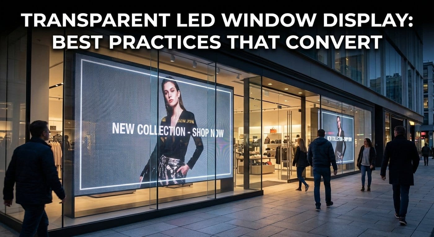
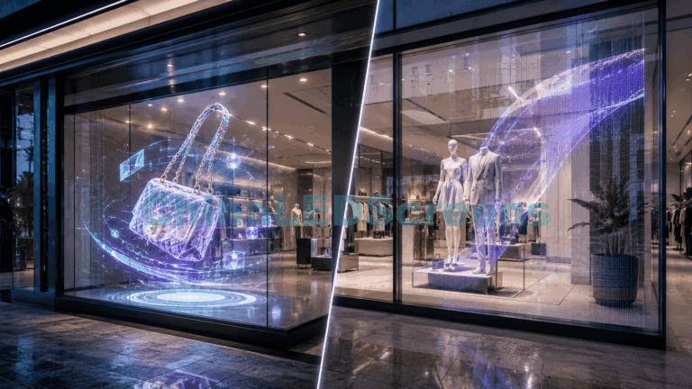
A transparent LED window display is one of the rare marketing tools that can do two jobs at once: sell the product and sell the space behind the glass. That’s why the best installs don’t feel like “a screen stuck on a window.” They feel like the store itself is alive—without blocking daylight or the interior vibe.
But “transparent LED” is also the easiest category to get wrong in retail, because the window is a brutal environment: mixed daylight, reflections, changing traffic speed, and viewers who give you three seconds before they move on.
This guide is a practical set of best practices—written the way an engineer and a retail marketer can both use it—to help your transparent LED window display convert more walk-bys into walk-ins (and more walk-ins into purchases).
If you want the product landscape first, start at the ChinaLEDScreens transparent LED display factory and then come back here.
What “convert” really means for window displays
Before specs and pixel pitch, align on the conversion path. Most window displays fail because they optimize the wrong step.
The real conversion funnel (for a storefront window)
- Attention capture (0–1s): “Something changed in my peripheral vision.”
- Message comprehension (1–3s): “I understand what this store offers.”
- Intent trigger (3–8s): “That’s relevant to me now.”
- Action (8–20s): step in, scan a QR, or stop to look.
- Reinforcement (inside): consistent story from window → interior.
Best practice: design your window content and hardware around step 1–3 first. If you try to communicate everything, you usually communicate nothing.
Step 1: Choose the right transparent LED type for a window
“Transparent LED window display” can be built using different product families. The right choice depends on glass type, installation constraints, viewing distance, and the store’s aesthetic tolerance.
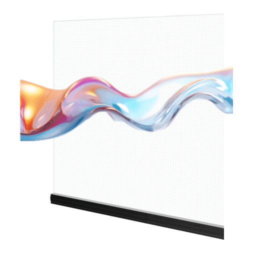
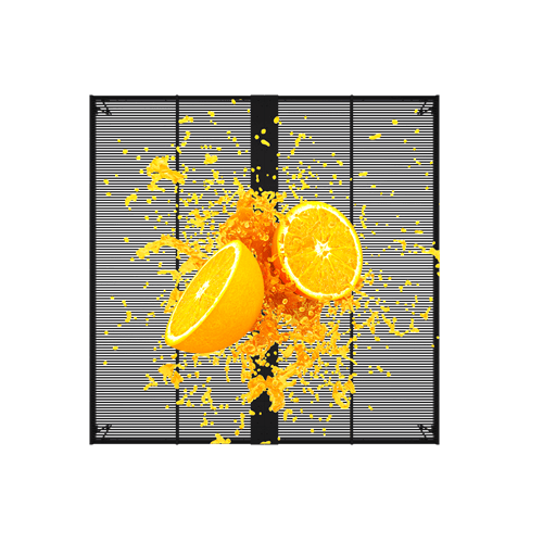
Transparent LED screens (cabinet/module systems)
Use when you need robust serviceability, higher brightness strategies, and scalable sizes—especially for flagship windows or large spans. See our transparent LED screens category for typical configurations.
Wins: modular service, strong daylight performance potential Watch-outs: structural visibility, depth, cable routing discipline
LED film screens (thin-profile on glass)
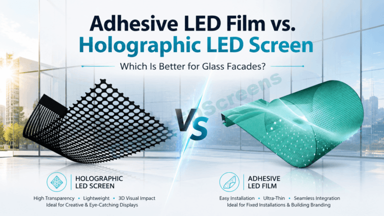
Film is often the cleanest look for retail windows where minimal visual obstruction matters. Use the LED film screens guide if you’re choosing between film structures and pitches.
Wins: ultra-thin, less “hardware look,” great for premium storefronts Watch-outs: reflections + content legibility need extra care
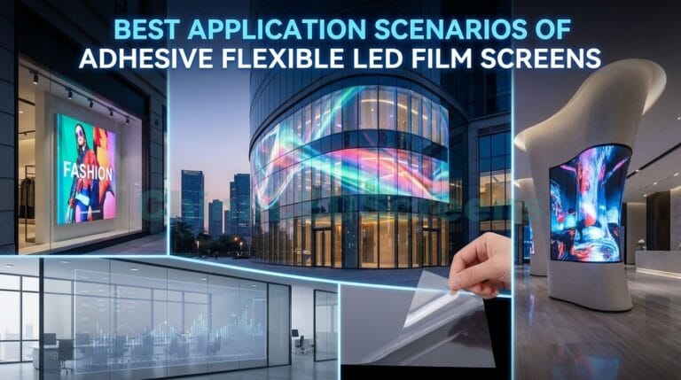
Adhesive / flexible LED film (curves, tricky geometry, fast installs)
If you have curved glass, odd mullion layouts, or need more installation flexibility, adhesive film can be the best answer. Reference the self-adhesive LED film selection guide when geometry and installation constraints dominate.
Wins: adaptable, modern, fast deployment Watch-outs: surface prep, long-term environmental planning, wiring neatness
If the architecture demands “glass-first integration” (premium façades, structural glass aesthetics, balustrades), treat it as a building-material conversation, not a signage conversation. Use the LED glass screens transparent LED glass guide to align with the right approach.
Wins: integrated aesthetic, architectural credibility Watch-outs: longer planning cycles, coordination with façade/glazing teams
Rule of thumb: If the window is primarily a marketing canvas, you can optimize for content + conversion. If the window is primarily an architectural element, you optimize for integration + compliance first, then content.
Step 2: Brightness isn’t the goal—legibility is
Retail buyers love asking for “more nits.” Engineers know the painful truth: brightness without legibility just makes glare.
The window legibility triangle
To “read” a window display, viewers need:
- Contrast (content stands out from background)
- Scale (text and objects are large enough at real viewing distance)
- Stability (no flicker, no weird banding on camera, smooth dimming)
Practical best practices
- Design for 5–10m readability, even if people walk closer. Most traffic is not standing 1 meter from the glass.
- Use bold shapes and short phrases, not paragraphs. Your window is not a website.
- Avoid low-contrast palettes (light gray on light backgrounds). It looks premium in Photoshop and disappears in daylight.
- Build day/night profiles: daytime needs punch; nighttime needs control (to avoid “over-bright, cheap” vibes and potential complaints).
Pro move: ask your content team to preview on a bright monitor near a window in daylight. If they can’t read it there, it won’t work on the street.
Step 3: Pixel pitch decisions should be tied to walking speed
Here’s the conversion-centric way to think about pitch:
- If your audience walks by fast (street-side, mall corridor), you need simple visuals, not dense detail.
- If your audience slows down (flagship entrance, queue area), you can use more product detail and tighter pitch.
A practical pitch mindset (without overpromising numbers)
- Close viewing (1–3m): great for product storytelling, but demands clean content design and tight calibration.
- Mid viewing (3–10m): sweet spot for most window displays—big brand visuals and clear offer messaging.
- Far viewing (10m+): treat it like a beacon (logo, campaign visual, directional cues).
Common mistake: teams overspend on ultra-fine pitch and then run content that’s basically an oversized PowerPoint slide.
Step 4: Placement on the glass makes or breaks perceived quality
A transparent LED window display is half optics, half psychology.
Inside-mount vs outside-mount
- Inside-mount (most common): protects the system and looks cleaner—but reflections can be worse because you’re behind the glass.
- Outside-mount (less common): can reduce some reflection issues but increases weather and security complexity.
Spacing from the glass
Even a small stand-off distance can reduce harsh reflections and improve perceived contrast. But more distance can introduce parallax issues depending on viewpoint.
“Background reality” behind the screen
Transparent LED is not opaque. Whatever sits behind it becomes part of the creative.
Best practices:
- If the interior is bright and busy, use content with stronger shapes and higher contrast.
- If the interior is dark and premium, you can use more subtle motion and luxury pacing.
- If the interior changes seasonally (displays, mannequins, pop-ups), plan content templates that can adapt.
Step 5: Content that converts follows the 3-second rule
This is where most competitors’ guides stay shallow. Let’s be specific.
The 3-layer content hierarchy (that actually works)
Layer 1: Brand + category (instant)
- “What is this store?”
- Use: logo, iconic visual, category cues
Layer 2: Offer or story hook (2–3 seconds)
- “Why should I care today?”
- Use: new arrival, limited drop, seasonal hook, hero SKU
Layer 3: Action or proof (optional, when viewers slow down)
- “How do I act?”
- Use: QR with incentive, social proof, “inside now,” “demo today”
Creative best practices that lift conversion
- Short loops (6–12 seconds) beat long videos in windows. Long loops lose the “entry point” for new viewers.
- Motion with restraint: use movement to attract, then hold a stable frame for comprehension.
- Text limits:
- 3–6 words for the main message
- 1 short CTA (optional)
- If you need more, you need a QR landing page, not more text.
- Dayparting: morning commuter messaging ≠ evening leisure messaging. Schedule it.
- Make the product feel real: if you show a hero SKU, show it large, show it clean, and let it breathe.
QR codes that don’t feel desperate
QR works when it’s a value exchange:
- “Scan to unlock member price”
- “Scan for today’s drop”
- “Scan to reserve a demo slot”
If your QR is just “learn more,” expect low scans.
Step 6: Engineering details that quietly affect conversion
Even the best content won’t convert if the display feels “cheap” in motion.
Refresh rate and camera behavior
Retail windows get filmed constantly (TikTok, Instagram, shoppers). If you see rolling bands or flicker on phones, your display becomes a liability.
Best practice:
- specify refresh and scanning performance appropriate for public-facing installs
- test with multiple phone models from different angles
Color calibration and consistency
Window displays live next to premium materials: glass, metal, stone, product lighting. Bad calibration makes the whole storefront look lower-end.
Best practice:
- insist on calibration workflow (factory + after installation)
- plan for re-calibration after major maintenance or seasonal content changes
Thermal and long-run stability
Windows can trap heat—especially behind glass in direct sunlight. If the system throttles brightness unpredictably, your content will look inconsistent day to day.
Best practice:
- plan ventilation and thermal path early
- avoid “sealed box behind sun-heated glass” designs without proper thermal thinking
Step 7: Operational playbook—keep it converting after week 1
The biggest ROI gap in retail LED isn’t hardware. It’s operations.
Content cadence
- Weekly: update offer hook (Layer 2)
- Monthly: update campaign creative (Layer 1 + 2)
- Seasonal: refresh story and product focus
Store team rules
- Define who can turn it on/off, who can change playlists, and what “good” looks like.
- Create a simple escalation path for faults (so the display isn’t off for 3 days).
Proof it works: measure, don’t guess
Even basic measurement improves conversion:
- footfall counters (or camera analytics where permitted)
- QR scan rate + landing conversion
- time-of-day performance
- A/B tests (two variants on alternating days)
If you want a solution-oriented starting point for retail scenarios, see our Retail Window LED Display page and map it to your storefront type.
Common mistakes (the ones we keep seeing)
- Too much transparency, too little contrast → looks “cool,” doesn’t sell.
- Content designed like a website → nobody reads it on the street.
- Over-investing in pitch and under-investing in creative + scheduling.
- No day/night brightness strategy → either invisible by day or obnoxious by night.
- No maintenance access plan → small faults become big downtime.
- No success metrics → the display becomes “expensive decoration.”
Quick best-practices checklist (RFQ + creative brief)
- Define viewing distance + walking speed
- Confirm sunlight exposure hours and glass type
- Choose product family (screen vs film vs adhesive film vs glass)
- Specify legibility targets (not just brightness targets)
- Build content hierarchy (brand → hook → action)
- Use short loops with clear entry frames
- Schedule dayparting playlists
- Plan calibration + thermal stability
- Define service access + operational owner
- Track 1–2 simple metrics from day one
Where to see real references
If you need internal alignment, nothing beats showing stakeholders examples. Browse our transparent LED display project gallery to compare window concepts and execution quality.