Talk To Our Expert, Get A Solution in 20 minutes
Share your LED screen needs. Our experts will provide solutions and a quick response.


Transparent displays are sold with one headline number: “transparency %.” But on real projects, that number behaves more like a budget you spend across structure, brightness, pixel pitch, viewing distance, and even the direction you expect people to look through the glass.
This guide explains what transparency rate really means, how it’s measured (and commonly “massaged”), and what “good” looks like for retail windows, glass façades, lobbies, and large-scale architectural installs—based on the way engineers and integrators actually specify jobs.
Simple definition: Transparency rate is the percentage of the display area that remains “open” so you can see through it (often described as open area ratio).
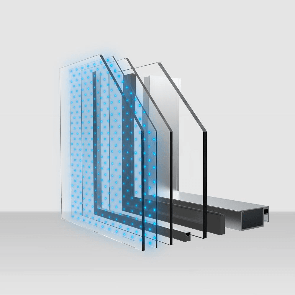
Useful definition for real projects: Transparency rate is how much visibility and daylight you keep after the entire system is installed, including:
If you only remember one thing: transparency is a system property, not a module property. A vendor can truthfully claim “80% module transparency” and you can still end up with 55–65% system transparency once you include structure.
Different suppliers may quote different things under the same label:
A high open-area ratio can still feel less transparent if the structure creates strong visual lines, moiré patterns, or glare.
Even if the hardware is 80% open, a bright white full-screen scene is effectively a “light curtain.” This is why the same install can look wonderfully transparent during dark content—and almost opaque during bright ads at noon.
At close range, the bars/strips are obvious, and the install feels less transparent. Step back, and the brain “fills in” the gaps, increasing perceived transparency.
When you’re writing an RFQ, asking “What’s the transparency?” is too vague. Ask for two numbers:
Good for comparing designs within the same product family.
This is what architects, brands, and facility owners actually experience.
Practical RFQ line you can copy:
If you want a solid baseline on how transparent systems are typically specified (and where the pitfalls are), reference your transparent LED display guide 2025 here: transparent LED display guide 2025
Some products are more transparent from one direction (because of how strips, louvers, or side-emitting optics are arranged). Always confirm:
If the project is retail, inside-out matters as much as outside-in.
Architectural glass is rarely a perfect rectangle of clear view. Mullions, frit patterns, spandrel bands, and anchors eat transparency quickly. Your display should be designed around these realities, not measured in a lab rectangle.
High transparency means fewer LEDs per square meter (less luminous area). To stay daylight-readable you often need either:

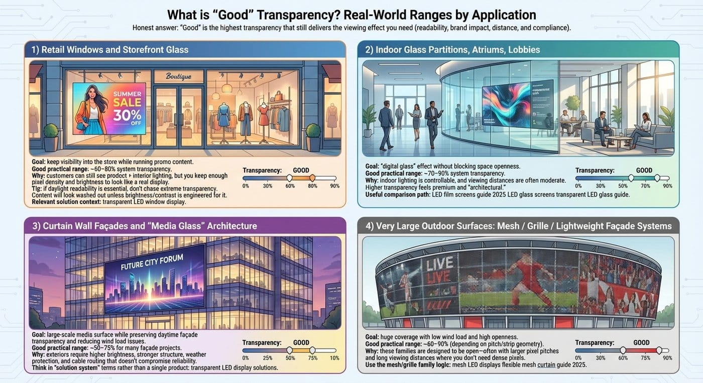
Here’s the honest answer: “good” is the highest transparency that still delivers the viewing effect you need (readability, brand impact, distance, and compliance).
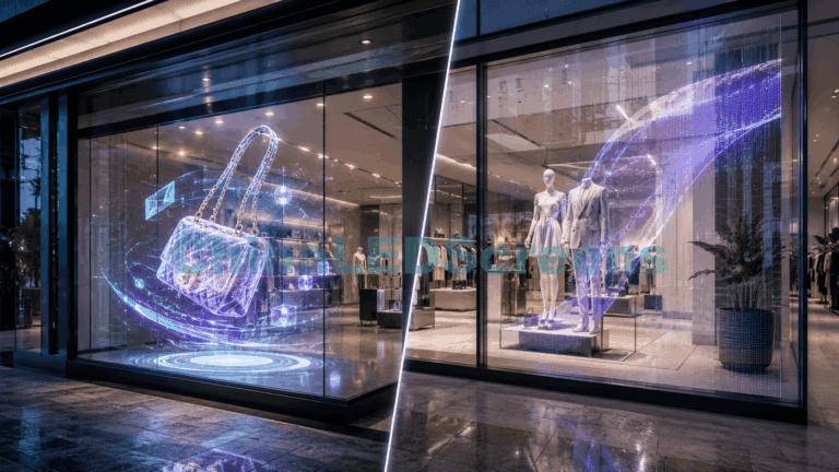
Goal: keep visibility into the store while running promo content.
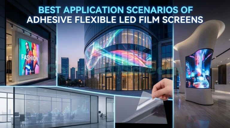
Relevant solution context: transparent LED window display
Goal: “digital glass” effect without blocking space openness.
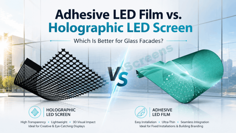
If your team is deciding between film vs glass vs cabinet-style, this is a useful comparison path: LED film screens guide 2025 LED glass screens transparent LED glass guide
Goal: large-scale media surface while preserving daytime façade transparency and reducing wind load issues.
For façade-first project planning, it helps to think in “solution system” terms rather than a single product: transparent LED display solutions
Goal: huge coverage with low wind load and high openness.
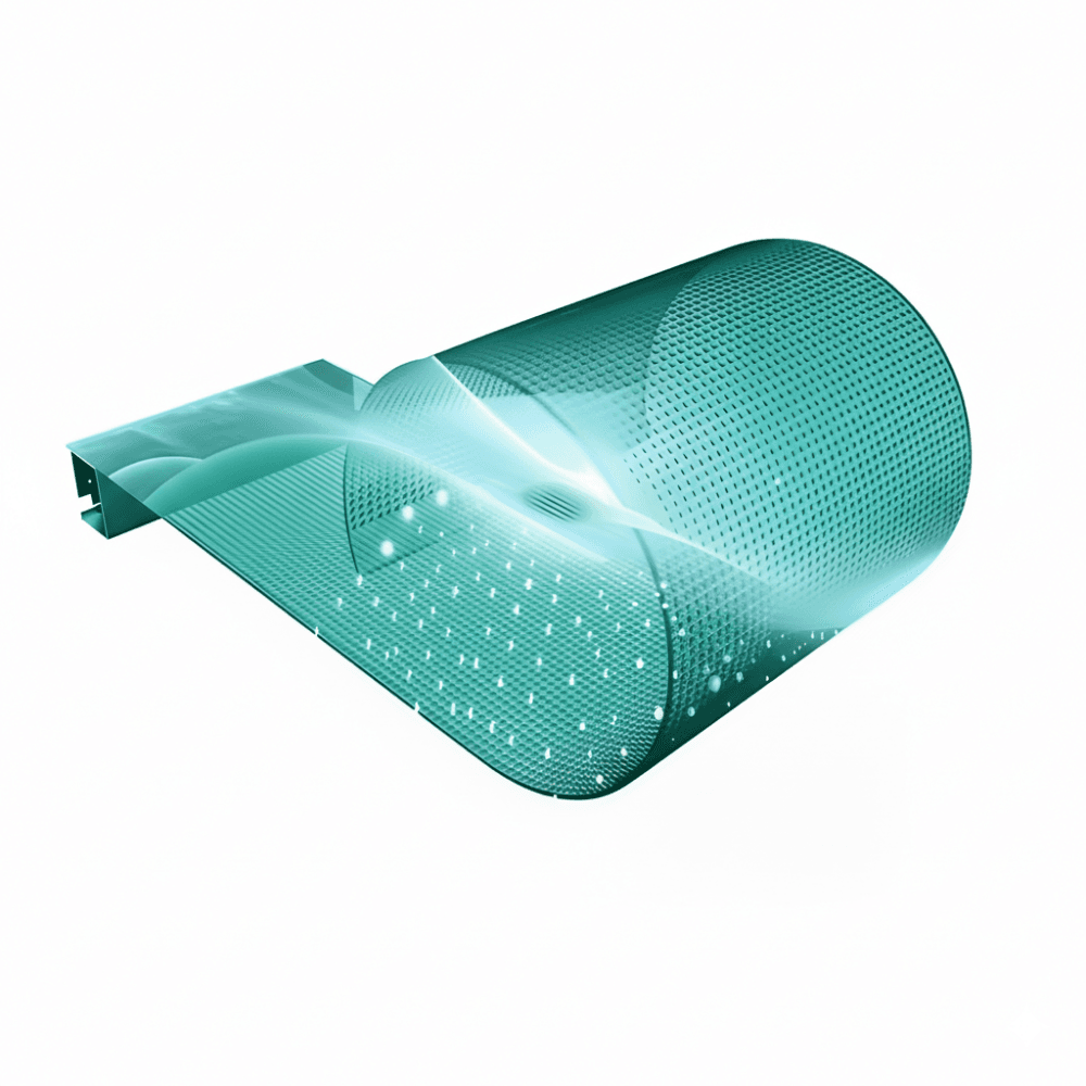
If you’re in this category, use the mesh/grille family logic (it’s a different game than window displays): mesh LED displays flexible mesh curtain guide 2025
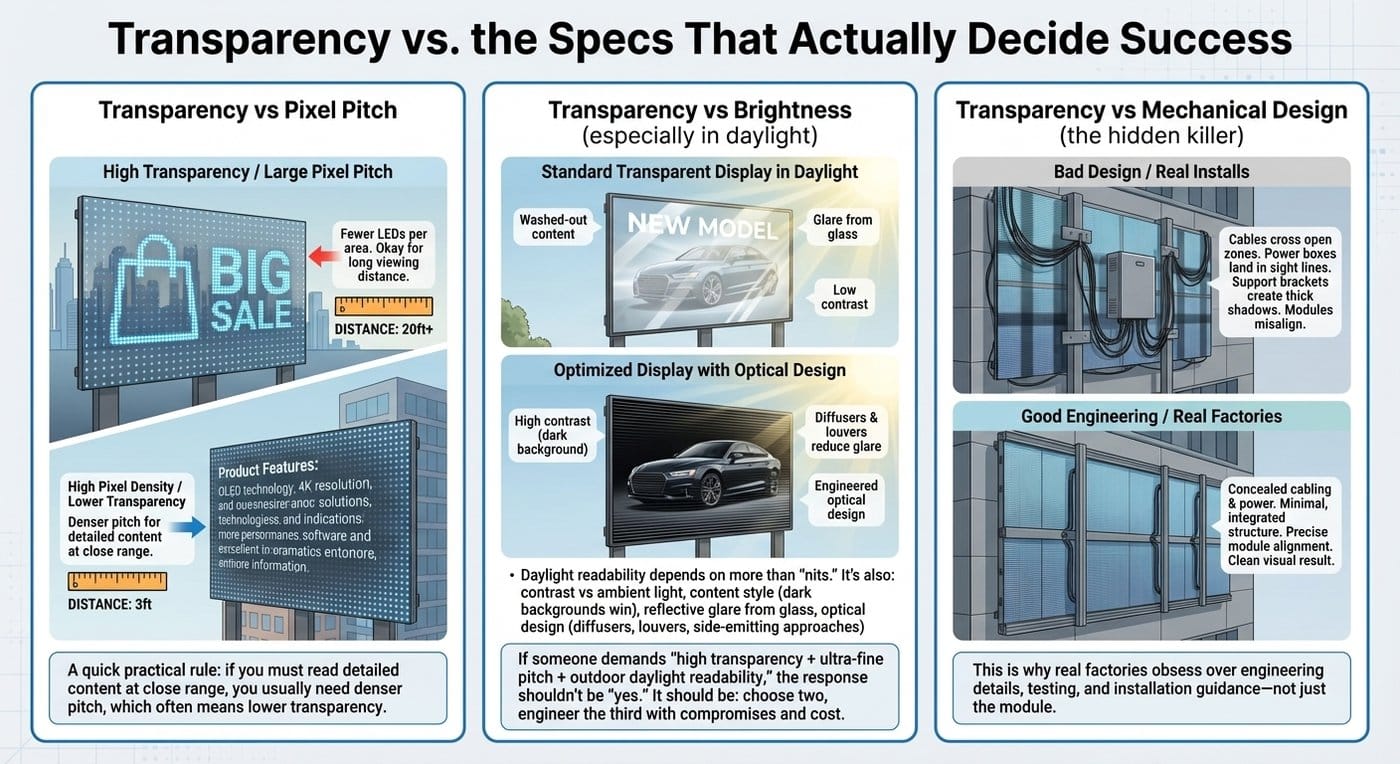
Higher transparency often means fewer LEDs per area, which typically pushes pixel pitch larger. That’s fine—if viewing distance supports it.
A quick practical rule: if you must read detailed content at close range, you usually need denser pitch, which often means lower transparency.
Daylight readability depends on more than “nits.” It’s also:
If someone demands “high transparency + ultra-fine pitch + outdoor daylight readability,” the response shouldn’t be “yes.” It should be: choose two, engineer the third with compromises and cost.
On large installs, the system can be “transparent on paper” but visually messy because:
This is why real factories obsess over engineering details, testing, and installation guidance—not just the module.
If you want to position your spec as engineering-led, you can reference your quality/technology context: transparent LED display technology
This is the shortcut that saves weeks:
Start from your product overview if stakeholders are still mixing categories: transparent LED display product categories
Use this when you want alignment between architect + integrator + buyer:
If you’re presenting to a client who’s stuck on “80% vs 90%,” translate it like this:
This framing prevents the classic failure: buying the highest transparency and then being disappointed by readability.
A transparent display succeeds when it preserves the space (light + visibility) and delivers the intended media impact. That’s why “good” transparency is always contextual.
If you want, we can turn your next project into a one-page spec brief: target transparency range, pitch, brightness strategy, structure notes, and a content guideline that keeps the glass feeling “open.” Start with the homepage for the right product family and route: ChinaLEDScreens