Talk To Our Expert, Get A Solution in 20 minutes
Share your LED screen needs. Our experts will provide solutions and a quick response.

When a buyer asks for “the highest transparency” on a transparent LED film screen, they’re usually protecting three things at once: daylight, views, and the glass-first aesthetic. The professional reality is that transparency is not a standalone number—it’s a system outcome shaped by pixel density, brightness strategy, content design, substrate materials, and installation details.
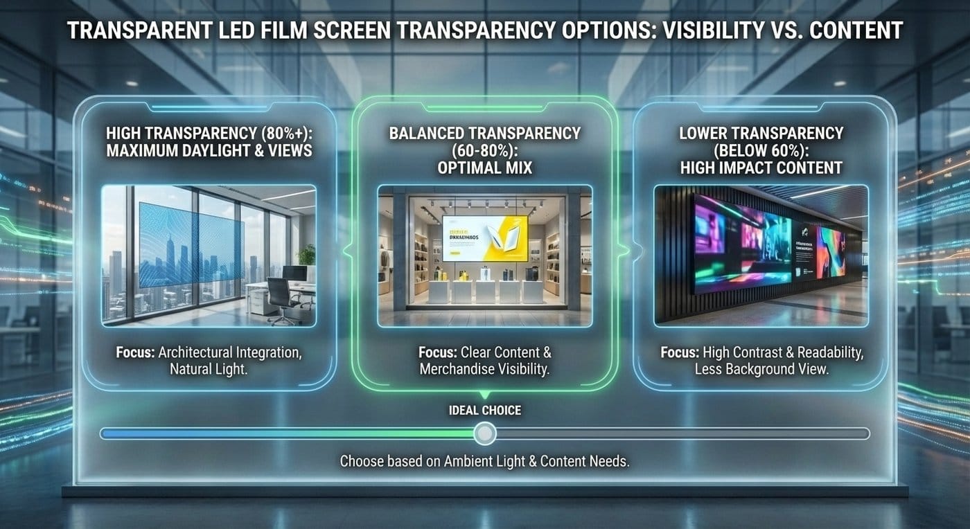
In real projects, transparent LED film screens typically fall into a ~55% to 90%+ transparency band. What matters most is choosing the right tier for your application—so you don’t sacrifice readability, contrast, or long-term stability just to win a spec-sheet contest.
Most procurement confusion comes from mixing three different transparency concepts:
This is the geometric “see-through” area when the screen is off. It’s influenced by:
Why it matters: Architects and brand teams judge first impressions in this mode—especially for premium storefronts and lobbies.
When content is running, transparency becomes psychological. It depends on:
A film with higher physical transparency can still feel less transparent if it’s playing high-APL bright content at high brightness.
This is the only number that matters in procurement:
Practical rule: if a supplier can’t define how they measured transparency, treat the percentage as marketing, not engineering.
Instead of chasing one number, use tiers that match how projects are actually specified.
Best for: premium retail windows, museums, flagship showrooms, and lobby glass where visibility behind the screen is non-negotiable.
Trade-offs you must accept:
Works best when: your content is designed like high-impact signage—large typography, bold shapes, high contrast.
Best for: most commercial wins—retail storefronts, corporate glass, mall atriums, mixed-use developments.
Why it wins RFQs:
If you want one range that satisfies architect + integrator + brand owner at the same time, Tier B is usually it.
Best for: large-area glass installs where readability and impact matter more than maximum see-through—especially when viewing distances are longer or content is detailed.
What you gain:
Transparent LED film design is a balancing act across three variables:

Push transparency up → fewer LEDs per m² → resolution and/or brightness usually drop. Push resolution up → more LEDs/traces → transparency typically drops. Push brightness up → higher drive/power/thermal loads → system design becomes stricter.
System thinking: Choose transparency only after you define viewing distance + content type + daylight environment.
A common mistake is choosing transparency first, then hoping brightness “works out.” In reality, transparent systems often need very different brightness behavior across conditions:
What this means for transparency selection:
Transparent film isn’t a phone screen—design like signage.
Dark and high-contrast content often reads better on transparent displays because it reduces washout and preserves the “floating” visual effect.
Fine textures can shimmer and lose clarity—especially in higher-transparency tiers where pixel density is lower.
Simple test: if the message isn’t readable in a quick glance, your transparency choice won’t save it.
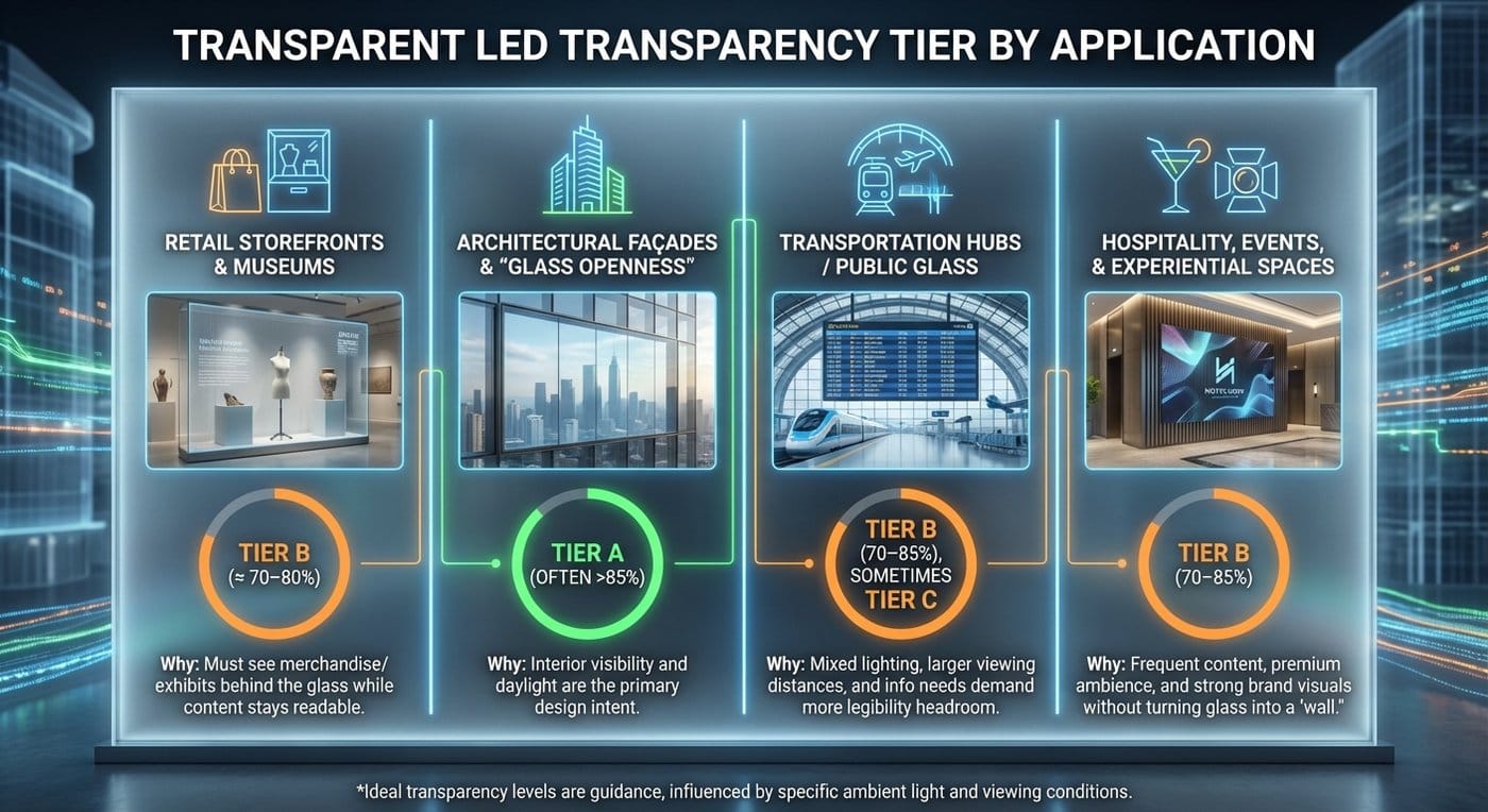
Use this as a practical selection map in stakeholder meetings.
Target: Tier B (≈ 70–80% is commonly ideal) Why: you must still see merchandise/exhibits behind the glass while content stays readable.
Target: Tier A (often >85%) Why: interior visibility and daylight are the primary design intent.
Target: Tier B (70–85%), sometimes Tier C for info-heavy use Why: mixed lighting conditions, larger viewing distances, and information needs often demand more legibility headroom.
Target: Tier B (70–85%) Why: frequent content updates, premium ambience, and strong brand visuals without turning glass into a “wall.”
“Film” is not one product class. The installation method impacts reliability, finish quality, and long-term stability.
A strong choice when you want:
Explore the product family: transparent LED film screen
Often chosen when:
Start here: guia de película adesiva flexível para LED
Material and bonding choices affect aging behavior. Poor substrate selection can reduce thermal stability and long-term durability, and weak bonding structures can create installation and maintenance risks.
Procurement takeaway: Specify substrate class and require evidence of aging/thermal testing—don’t accept “transparent film” as a sufficient definition.
Transparency is meaningless without pitch. Always request both.
If transparency doesn’t include busbars/connectors, your installation may look very different from product photos.
Transparent glass needs brightness control to remain premium. Don’t let a supplier quote one brightness number and call it done.
Ask for demos with your real content type (logos, typography sizes, brand colors).
And keep expectations grounded: 100% transparency isn’t achievable with current LED film display architecture.